▶自然言語処理(しぜんげんごしょり、英語: natural language processing、略称:NLP):人間が日常的に使っている自然言語をコンピュータに処理させる一連の技術であり、人工知能と言語学の一分野である。
▶JAR파일 : 클래스 파일의 효율적인 배포를 위해 여러 클래스 파일들을 하나로 묶어 단일의 파일로 만드는 포멧. 로컬(local)상에서 편리한 관리는 물론 자바(Java) 프로그램 실행 중에 원격지에서 하이퍼텍스트 전송 규약(HTTP) 등을 통해 내려받기(download)되어 바로 사용이 가능.
▶WAR파일 : jsp, 서블렛, 자바, html 등 웹어플리케이션 생성에 필요한 파일들이 모여있는 파일
▶batch file : A batch file is a text file that contains a sequence of commands for a computer operating system. It's called a batch file because it batches (bundles or packages) into a single file a set of commands that would otherwise have to be presented to the system interactively from a keyboard one at a time. A batch file is usually created for command sequences for which a user has a repeated need. Commonly needed batch files are often delivered as part of an operating system. You initiate the sequence of commands in the batch file by simply entering the name of the batch file on a command line.
▶Shell : 리눅스는 커널(Kernel)이라고 불리는 하드웨어를 직접 제어하는 부분과 그 위에서 커널에 명령을 주는 하나 이상의 쉘(Shell)로 구성되어 있다. 커널은 하드웨어를 직접 제어하는 리눅스의 핵심부로서 쉘에서 임무를 받아서 수행한다. 쉘은 명령어 기반 인터페이스 인데 이것을 통해서 사용자는 리눅스 OS와 상호 작용을 하게된다.우리가 도스상에서 내리는 대부분의 명령은 command.com이라는 파일이 처리한다. 전문가들은 이 command.com파일을 운영체제의 쉘(Shell)프로그램이라고 말한다. 쉘 프로그램은 사용자가 내린 명령을 운영체제가 수행할 수 있는 명령어를 입력받고 이를 컴퓨터의 운영체제에 전달하는 일을 한다. 다시 말해 쉘은 사용자가 내린 명령을 커널이 이해할 수 있도록 통역해준다. 그래서 명령어해석기라고도 불린다.
▶kernel :운영체제의 핵심은 커널 부분이다. 도스로 말하면 io.sys와 같은 파일이 이에 해당한다. 실질적으로 사용자가 내린 명령을 수행하면서 컴퓨터의 하드웨어를 조작하는 파일이다. 이 처럼 실질적으로 사용자의 명령을 수행하면서 파일의 입출력을 담당하고, 하드웨어를 관리하는 프로그램을 커널이라고 한다. 그리고 운영체제의 핵심은 커널이라고 부른다.
※쉘과 커널로 구분하는 이유 : 운영체제의 핵심이 커널이지만 사용자가 바로 커널을 제어하기는 매우 어렵다. 기계적인 부분이 많기 떄문이다. 그래서 사용자가 내린 명령을 운영체제의 핵심인 커널 부분이 이해할 수 있도록 번역해주는 프로그램이 필요 했고 이 번역장치에 해당하는게 쉘이다. 그래서 우리가 운영체제라고 부르는 프로그램은 크게 커널과 쉘로 구성 된다
▶Amazon Web Services(アマゾン ウェブ サービス、AWS): AWS의 주요 고객은 개발자 엔지니어 등IT관계자이며,AWS가 제공하는 서비스는 ‘인프라’다.
웹사이트를 구축한다고 치자. 개발자는 웹사이트에 들어갈 이미지와 글을 저장해야 한다. 사용자에게 웹사이트 내용을 보여주도록 명령하고 제어하는 시스템도 필요하다. 이러한 과정을 위해선 스토리지나 서버 등을 설치해야 한다. 개발자는 이러한 하드웨어를 설치할 공간을 사무실 한켠에 마련하고 각종 환경설정 및 네트워크 환경을 구축하기 위해 며칠씩 시간을 소비한다.
만약 3일만 웹사이트를 운영하고 싶다면 어떨까? 3일 동안 사용하기 위해 서버와 스토리지를 구매하기엔 비용이 너무 많이 들어간다. 게다가 사용자가 늘어나거나 웹사이트 내부에 저장할 데이터가 많아지면 서버나 스토리지를 더 구매해야 한다. 그런데 3일 뒤 사용자가 썰물처럼 빠져나가면 이미 구매한 서버나 스토리지는 개점 휴업 상태가 된다. 비용 측면에서 꽤나 비효율적이다.
이러한 상황을 개선한 게 클라우드다.AWS는 대량의 서버, 스토리지, 네트워크 장비를 구매해놓고 사용자가에 인프라를 대여해준다. 사용자는 각 장비를 사용한 만큼만 비용을 지불하면 된다. 그래서AWS서비스를 ‘인프라로서의 서비스’(InfrastureasaService,Iaas)라고 부른다.
그렇다면 어떤 기업이AWS에 주로 관심을 보일까? 처음에는 주로 예산이 적은 스타트업이 클라우드에 관심을 보였다. 모바일게임 업체가 대표적이다. 10만명의 게임 사용자를 예상하고 하드웨어를 구매했는데, 막상 게임을 출시했더니 사용자가 100만명이 몰릴 수도 있다.AWS는 사용자 수에 맞춰 단 몇 분 안에 서버를 자동으로 증설해준다. 게임업체는 물리적인 하드웨어를 구매하는 것보다 더 빠르고 안정적으로 서비스를 운영할 수 있다. 서비스를 테스트하려고 임시 인프라를 구축할 때도 클라우드를 많이 이용한다. 해외 진출을 노리는 업체들에게도 인기가 높다. 클라우드 업체는 북미, 유럽, 아시아 등 여러 곳에 인프라를 구축해놓는다. 사용자는 이용하고 싶은 지역을 자유롭게 선택할 수 있다. 한국 기업이 미국 사용자를 대상으로 게임을 내놓을 때 지역 설정만 바꾸면 보다 빠른 속도로 서비스를 제공할 수 있다.
클라우드 이전에 비슷한 서비스가 웹 호스팅, 서버 호스팅이었다. 이들 서비스는 어떤 차이가 있을까? 먼저 웹 호스팅 업체들은 서버를 대신 구매하고 서버 공간을 분할해서 사용자에게 나눠준다. 웹 호스팅 업체들이 대부분 설정과 구축 환경을 관리하기 때문에 사용자는 원하는 소프트웨어를 따로 설치할 수 없다. 반대로 생각하면 사용자는 인프라에 대해 잘 몰라도 웹 호스팅 업체들이 제공하는 기능을 선택해 웹사이트를 구축할 수 있다. 비전공자가 간단한 개인용 웹사이트를 구축하기 위해서 이러한 웹 호스팅 서비스를 많이 이용한다.
서버 호스팅은 서버 1대를 통째로 빌려주는 서비스를 일컫는다. 클라우드는 서버 호스팅과 비슷하지만 다양한 메모리나 스토리지 용량 등을 선택할 수 있고 인프라 규모도 무한대로 늘릴 수 있다는 차이가 있다. 클라우드 서비스는 엔지니어 입맛에 맞게 인프라를 구축할 수 있지만, 반대로 내부에 전문가가 없는 기업에선 이러한 클라우드 서비스가 어려울 수 있다. 서버 호스팅 업체들은 컨설팅을 통해 인프라를 분석해주고 맞춤 서비스를 제안해주면서 경쟁력을 높이고 있다.
▶RPA : Robotic Processing Automation. It is an automatic system which makes process automated which is repetitively performed.
▶EMT : Easy Master maintenance Tool
▶MarkUp Language : (초간략)문서의 기본 정보에 추가적인 정보를 제공하기 위해 사용되는 언어. 문서를 구성하는 가장 기본적인 텍스트 이외에 내용을 강조하기 위해 밑줄을 긋는다던지, 펼표를 친다던지, 글의 논리적 구성을 나눈다던지(서론, 본론...,결론) 하는 작업이 쉽게보면 마크업에 해당한다. 정리하면, 마크업(Markup)이란 문서의 내용이 아니라 내용이 어떻게 배치되고 어떤 크기와 모양을 가지며 여백은 어느 정도인지를 표현하는 기술이라고 볼 수 있다.
(간략)태그등을 이용하여 문서나 데이터의 구조를 명기하는 언어의 한 가지이다.태그는 원래 텍스트와는 별도로 원고의 교정부호와 주석을 표현하기 위한 것이였으나 용도가 점차 확장되어 문서의 구조를 표현하는 역할을 하게 되었다. 이러한 태그 방법의 체계를 마크업 언어라 한다.
문서에는 문서 내용 이외에, 문서의 논리 구조나 체제와 같은 문서의 서식 작성(formatting)을 지정하거나, 문서 내용의 찾아보기 또는 찾아보기 작업(indexing) 방법을 지정하거나 문서 중의 단어나 구, 화상과 같은 어떤 요소를 같은 문서 또는 다른 문서 중의 다른 요소와 연결(link)하는 방법을 지정하여 컴퓨터 시스템에 지시하는 마크업 정보가 추가된다. 마크업 언어는 문서 내에 끼워 넣는(embed) 일련의 부호로 구성된다. 대표적인 마크업 언어로는 월드 와이드 웹(WWW)의 홈 페이지에 사용되는 하이퍼텍스트 생성 언어(HTML)와 국제표준화기구(ISO)가 표준화한 표준 범용 문서 생성 언어(SGML)를 들 수 있다. 이런 종류의 마크업 언어는 대부분 텍스트 문서와 파일이 기종과 독립적으로 응용 프로그램 간에 교환될 수 있도록 이식성을 높이기 위해 설계되었다.
▶XML(Extensible Markup Language): W3C에서 개발된, 다른 특수한 목적을 갖는 마크업 언어를 만드는데 사용하도록 권장하는 다목적 마크업 언어이다. XML은 SGML의 단순화된 부분집합으로, 다른 많은 종류의 데이터를 기술하는 데 사용할 수 있다. XML은 주로 다른 종류의 시스템, 특히 인터넷에 연결된 시스템끼리 데이터를 쉽게 주고 받을 수 있게 하여 HTML의 한계를 극복할 목적으로 만들어졌다.
1. HTML의 한계를 극복하고자 나왔다.
2. 사용자 정의 TAG가 가능하다.
3. 인터넷에 연결된 시스템끼리 쉽게 정보를 주고받는다.
▶node.js : JS는 웹브라우저에서만 사용되는 언어였는데, JS를 웹 서버에서도 사용될 수 있도록 한 것이 nodejs이다. 어떻게 그렇게 했다는거?
▶Internet : (간략)인터넷은 다른 컴퓨터와 연결될 수 있는 네트워크 환경을 의미한다. 그리고 그 환경 내에서 사용되는 소프트웨어가 WEB이다. WEB은 인터넷 환경에서 가장 성공적인 소프트웨어 이기 때문에 때로는 동의어로 사용되기도 하는 것이다.
(상세)TCP/IP 프로토콜을 통해 연결되어 있는 전 세계적인 네트워크를 두고 말한다.컴퓨터 기술과 통신 기술이 기본이 되어, 각기 다른 기관에 의해 다른 목적으로 구성된 네트워크들이 서로 연결되어 전 세계를 묶는 하나의 거대한 네트워크로, 다양한 서비스를 제공하는 지구촌 네트워크
▶WEB : 하이퍼텍스트 기능에 의해 인터넷상에 분산되어 존재하는 온갖 종류의 정보를 통일된 방법(Protocol)으로 찾아볼 수 있게 하는 광역 정보 서비스 및 소프트웨어를 말한다. 분산되어 존재하는 정보들을 하나의 체계 안에서 공유하기 위해서 약속한 규약이 HTTP(Hyper Text Tranfer Protocol)이며, 그러한 규약 안에서 사용되는 언어가 HTML(Hyper Text Markup Language)이다. 웹브라우저, 웹서버, 웹어플리케이션 서버, 데이터베이스로 구성된다.
*hypertext : 하이퍼텍스트란 문서와 문서가 link로 연결되어 있는 새로운 형식의 text를 의미한다.
▶Web Browser(Client) : 웹 서버에 자료를 요청하기 위해 HTTP를 사용하는 클라이언트 프로그램으로, 클라이언트 쪽에서 인터넷에서 웹서버의 하이퍼텍스트 문서를 볼 수 있게 해주는 프로그램이다. 일반적인 기능으로는 웹페이지 열기, 최초 방문한 인터넷 주소(URL)의 목록 제공, 자주 방문하는 URL 기억 및 관리, 웹페이지 저장 및 인쇄, 전자우편이나 뉴스그룹을 이용할수 있는 프로그램과 HTML 문서 편집기능 등이 있다.
▶Web Server : 웹페이지(HTML파일)를 제공해 주는 서버를 말하는 것으로 HTTP를 사용하여 웹페이지를 제공할수 있는 웹 서버 프로그램이 설치되고 있고 하나의 도메인 이름을 갖고있다. 예를 들어 사용자가 웹 브라우저에서 URL로 http://www.daum.net를 입력하면 도메인 이름이 www.daum.net인 서버에게 웹 페이지를 요청하고 서버는 index.html 파일을 찾아서 브라우저에게 보낸다. 따라서 가장 일반적인 웹 서버로는 UNIX 기반의 아파치, WINDOW NT IIS, 네스케이프의 엔터프라이즈 서버가 있다.
보통 서버는 기존의 우리가 알고 있는 컴퓨터와는 다른 금고같은 모양을 하고 있지만, 단지 서버쪽은 스크린이 필요없고 더 안정적인 부품이 필요하기에 그런 모양새가 된것이지, 일반적인 컴퓨터와 동일하다. 또한, 웹서버만 설치하면 개인 PC도 웹서버의 기능을 할 수 있다.
▶Apache : 서버 쪽의 컴퓨터에는 웹서버 어플리케이션이 존재해야만 웹브라우저에서 요청하는 정보를 받아들이고,응답할 수 있다. 이처럼 request를 받아들이고 response의 기능을 가지고 있는 것이 웹서버 어플리케이션인데, 이중 가장 대표적인 소프트웨어가 Apache이다.
▶Tomcat : 평소 tomcat과 apache를 잘 구분하지 못하여 공부한 내용을 정리해 본다.아파치 톰캣을 이용해서 웹서버를 띄우고 개발을 진행해왔다. 그런데 실제 일을 하면서 서버를 실핼할때 단순히 tomcat만 쓰는게 아니라 apache라는 프로그램을 별도로 실행하는 것에 혼란이 왔다. 그리고 평소에 apache tomcat은 그렇다면 두개의 프로그램을 합쳐놓은 것인가를 고민하게 되어 정리해 보았다.
1.apache 란?
apach란 것은 소프트웨어 단체 이름이다. 그리고 우리가 흔히 부르는 아파치서버라는 것은 이제단에서 후원하는 오픈소프 프로젝트 커뮤니티에서 만든 http웹서버를 지칭하는 말이다. (아파치 프로젝트는 웹서버 외에도 여러가지 프로젝트를 진행하고 있다고 한다. 이건 추후에 조사해볼것이다.) http 웹서버는 http 요청을 처리할 수 있는 웹서버이고, 아파치 http서버는 http요청을 처리하는 웹서버인 것이다. 클라이언트가 GET, POST, DELETE 등등의 메소드를 이용해 요청을 하면 이 프로그램이 어떤 결과를 돌려주는 기능을 한다. 아파치는 웹서버 이다!
2.tomcat 이란?
tomcat은 흔히 WAS(Web Application Server)라고 말한다. WAS는 웹서버와 웹 컨테이너의 결합으로 다양한 기능을 컨테이너에 구현하여 다양한 역할을 수행할 수 있는 서버를 말한다. 클라이언트의 요청이 있을 때 내부의 프로그램을 통해 결과를 만들어내고 이것을 다시 클라이언트에 전달해주는 역할을 하는 것이 바로 웹 컨테이너 이다. 앞에서 본 아파치 웹 서버와 차이는 이 컨테이너 기능이 가능하냐의 차이가 가장 크다고 생각한다.
WAS역시 웹 서버로써 역할을 수행할 수 있기 때문에 둘을 잘 구별하지 못하면 필자 같은 혼란이 생길 수 있다.
3.둘의 차이는?
그렇다면 WAS만 쓰면 되지 어째서 웹서버를 따로 쓰느냐는 의문이 생길 수 있다. 그 이유는 목적이 다르기 때문이다. 웹 서버는 정적인 데이터를 처리하는 서버이다. 이미지나 단순 html파일과 같은 리소스를 제공하는 서버는 웹 서버를 통하면 WAS를 이용하는 것보다 빠르고 안정적이다(왜? 다른 글 소스로 써볼까?) WAS는 동적인 데이터를 처리하는 서버이다. DB와 연결되어 데이터를 주고 받거나 프로그램으로 데이터 조작이 필요한 경우에는 WAS를 활용 해야 한다.
4.연동의 필요성
대부분의 웹 컨테이너(톰캣 포함)는 웹서버 기능이 포함되어 있다. 그럼에도 불구하고 다른 웹서버와 연동해서 사용하는 이유를 정리해 보면 다음과 같다.
-톰캣은 아파치 웹서버 만큼 정적인 문서를 빠르게 처리하지 못한다. -톰캣은 아파치 웹서버 만큼 다양한 옵션 및 환경 설정 기능을 제공하지 못한다. -톰캣은 아파치 웹서버 만큼 안정적이지 못하다. -이미 많은 사이트들이 웹서버 기반으로 많은 시스템 들을 개발하였다. 예를 들어, CGI, PHP 등 서버 사이드 애플리케이션 들과 더불어 다양한 모듈들이 포함되어 있는데 이 모든 기능을 톰캣에서는 실행시킬 수 없다.
이러한 이유로 웹서버와 톰캣을 연동해서 사용하는 것을 권한다. 또한 웹서버와 연동을 시키지 않은 상태에서 톰캣에 접속하기 위해서는 HTTP의 기본 포트인 80포트가 아닌 8080 포트를 통해서 접속해야만 한다[1]. 이때 아파치 웹서버와 톰캣을 연동을 시키게 되면 8080 포트가 아닌 웹서버의 표준 포트인 80포트를 이용해서 접속이 가능하다. 이러한 이유 외에도 다양한 문제가 존재한다. 예를 들어 보안과 관련된 문제도 발생할 수 있으며 하나의 웹서버에 여러 개의 톰캣을 연결해서 로드 발랜싱을 구현할 수도 있다. 즉 좀 더 폭넓은 선택과 운영의 유연성을 제공하기에 필자는 웹서버와의 연동을 반드시 하기를 권한다. 구체적 연동방법 -> 클릭
▶htdocs(document root) : 웹서버가 웹브라우저에서 요청한 문서를 찾는 최상의 디렉토리이다. 디폴트로 설정된 디렉토리로 htdocs의 디렉토리에 저장해야만 클라이언트가 원하는 문서를 전달할 수 있는데, 설정변경을 통해 다른 디렉토리로 변경이 가능하기는 하다.
▶CUI(Character User Interface) : 文字だけでやり取りをするのですが、代表的なものは Windowsに搭載されている CMDといわれるものです。
▶GUI(Graphical User Interface) : GUIは、グラフィカルな画面で分かりやすく情報のやり取りができます。今使っているWindowsのパソコンが GUIです。キーボードの他 マウスやタッチパネルも使われます。
▶IP(Internet Protocol):(간략)각 가정의 전화선에도 부여된 전화번호가 존재하듯, 각 네트워크 선에도 부여된 주소가 존재하는데 이것을 IP라고 부른다. 모든 장비에는 IP 주소가 부여되어야만 한다는 의미로 이해하면 되겠다.
(상세)IP 주소(Internet Protocol address, 표준어: 인터넷규약주소)는 컴퓨터 네트워크에서 장치들이 서로를 인식하고 통신을 하기 위해서 사용하는 특수한 번호이다. 네트워크에 연결된 장치가 라우터이든 일반 서버이든, 모든 기계는 이 특수한 번호를 가지고 있어야 한다. 이 번호를 이용하여 발신자를 대신하여 메시지가 전송되고 수신자를 향하여 예정된 목적지로 전달된다. IP 주소를 줄여서 IP라고 부르기도 하나 IP는 인터넷 규약 자체를 가리키는 말이기 때문에 엄밀하게는 구별해야 한다.
▶IPv4 주소 : IPv4는 32비트 데이터로 구성된 IP 주소를 말하며 우리가 보편적으로 쓰고 있는 IP 주소 체계다. 보통 aaa.bbb.ccc.ddd 형식으로 표기하는데, 0~255 사이의 숫자 4개로 구성된다. 물론 이것은 사람이 보기 쉽게 표기한 것이고 실제 컴퓨터 내부에서는 0 ~ 4,294,967,295까지의 정수로 표현되고 있다. 범위에서 볼 수 있듯이 대략 42억개의 주소를 사용할 수 있는 셈인데 특수한 목적을 위해 예약해 둔 영역도 제법 되고, 한 명이 여러 개의 아이피를 사용하는 경우도 많이 있었기에 2011년 2월 5일 기준, 공인 아이피 주소가 모두 고갈된 상태다.[3](#)
예전에는 IP를 할당할 때 클래스를 나누어서 할당하였는데 처음에는 주로 Class-B(128.0.0.0~191.255.255.255)의 영역에서 할당했지만인터넷이 점점 발달되고 보편화되면서 IP 주소의 소모가 빨라지자 클래스로 나누어 할당하는 방식을 더 이상 사용하지 않고 대신 CIDR(사이더)란 방식으로 할당하기 시작하였다.
IPv6은 128비트 데이터로 구성된 IP 주소를 말하며 IPv4의 주소가 고갈되는 것에 대비해 만들어 둔 IP 주소 체계이다. 앞으로 늘어날 아이피 주소의 수요를 감당하기 위하여 128비트를 사용하는 IPv6로 전환될 예정이다. IPv6은 총 2^128개 주소를 가질 수 있으므로 통신이 가능한 기기마다 공인 IP를 하나씩 할당해도 고갈될 걱정이 없을 정도로 주소가 매우 넘쳐날 것으로 기대하고 있다. 참고로 알기 쉽게 수치화하면, IPv4의 최대 할당 가능한 IP 개수가 2의 32제곱으로 4,294,967,296개인 반면, IPv6의 최대 할당 IP 개수는 2의 128제곱인340,282,366,920,938,463,463,374,607,431,768,211,456(약 340간)개이다. 사실상 무한하다고 생각해도 될 정도의 개수다. 자리수만 39개다.참고로 IP 주소 하나가 1g이라고 치면 IPv4는 4294t 정도이지만 IPv6는 태양 질량의 20만배에 달한다. 유선 인터넷은 미국과 유럽 지역부터 보급이 이루어지고 있으며, 모바일 인터넷도 차차 IPv6으로 전환 중인 추세다.
▶공인ip와 사설ip의 이해
공인 IP는 '서울시 도봉구 창2동 624-15' 와 같이 우편물이 배달 가능한 주소이고 사설 IP는 '우리 집의 작은방에 책상서랍' 과 같이 우리 집에서만 이해 가능한 주소입니다.
▶공인 IP(global IP): 앞에서 설명한 IPv4 주소는 임의로 우리가 부여하는 것이 아니라 전세계적으로 ICANN이라는 기관이 국가별로 사용할 IP 대역을 관리하고 우리 나라는인터넷 진흥원(KISA)에서 우리나라 내에서 사용할 주소를 관리하고 있다. 따라서, 임의로 아무 IP 주소나 내 컴퓨터에 지정한다고 인터넷이 되는 것이 아니라 할당받은 주소를 부여해야만 인터넷에 접속할 수 있게 된다.
A 클래스는 네자리의 IP 주소 대역 중에서 두번째, 세번째, 네번째 주소를 마음대로 부여할 수 있는 최상의 클래스로 클래스 당 255 x 255 x 255 개의 주소를 가질 수 있다.
B 클래스는 네자리의 IP 주소 대역 중에서 세번째, 네번째 주소를 마음대로 부여할 수 있는 클래스로 클래스 당 255 x 255 개의 주소를 가질 수 있다.
C 클래스는 맨 뒤 네번째 자리만 마음대로 부여할 수 있는 주소로 클래스 당 255개의 주소를 갖는다.
이와 같이 클래스를 분류해뒀는데, 문제는 IP가 부족하다보니 서버 운영 시에 원하는 대로 IP 주소를 부여받을 수 없고, 서버 운영 업체나 기관 들에 할당된(미리 돈을 지불하고 산다) 주소 중에서 자신의 컴퓨터에 주소를 할당 받아야 한다.
최근의 IP 부족 사태는 인터넷 발전 초기에 IP 주소를 무계획적으로 배분했기 때문에 발생하는 문제이다. 대표적으로 미국의 일반 기업인 IBM이나 모토롤라 등은 초기에 인터넷 주소를 부여받으면서 A 클래스를 부여받았고, 우리나라내에서도 KAIST나 서울대 등은 B 클래스를 보유하여 학교내의 PC들에게도 마구 공인 IP를 부여하고 있는 웃지 못할 상황이다. 반면 최근에 IP를 신청하는 기업은 많은 비용을 지불하고도 C 클래스 대역조차 얻기가 쉽지않은 현실이다.
▶사설 IP(private IP) : 전체 IP 대역 중에서 특수한 목적으로 사용하기 위해서 몇 개의 대역을 제외하고 공인 IP 대역으로 할당하고 있는데, 제외된 대역 중에서 사설 IP로 사용되는 대역은 사용자가 임의로 부여하고 사용할 수 있지만 인터넷 상에서 서로 연결되지 않도록 되어 있다. 전체 IP 대역 중에서 다음의 대역이 사설 IP 대역이다.
A 클래스 : 10.0.0.0 ~ 10.255.255.255
B 클래스 : 172.16.0.0 ~ 172.31.255.255
C 클래스 : 192.168.0.0 ~ 192.168.255.255
위의 3개의 클래스 대역은 사용자가 자신의 컴퓨터에 임의로 부여해도 되는 IP 주소 대역이 된다.
따라서 회사 내부나 집에서는 공인 IP를 부여받지 않은 상태에서 위의 주소 대역 중에서 아무 주소나 할당을 해도 문제가 발생하지 않는다는 것이다.
따라서 공인 IP 주소가 모자랄 경우 사설 IP로 회사나 가정 내의 IP 주소를 부여하고 공유기 등에 고정 IP를 부여한 다음에 인터넷에 접속하는 방식이 널리 퍼지게 되었고, 대부분의 장비가 현재는 사설 IP를 부여하고 공유기나 라우터(사실 공유기가 라우터다)를 통해 인터넷에 접속하게 된다. 단 사설 IP를 부여한 컴퓨터는 공인 IP에서 알아볼 수가 없다는 점이 특징이다.
위의 그림을 보면 컴퓨터에 부여된 IP 주소인 192.168.0.2 ~ 192.168.0.4과 공유기의 내부 주소인 192.168.0.1은 사설 IP이고 공유기가 인터넷에 연결된 168.126.63.1은 공인 IP가 된다. 서버에 설치된 IP인 164.124.101.2도 공인 IP이다. 따라서 인터넷 상에서 164.124.101.2라는 주소를 치면 서버에 접속할 수 있지만 192.168.0.x 대역에 있는 피시와 노트북에는 접속할 수 없다. 가정에 설치된 공유기 관리 화면에 접속해보면 위의 같은 형태로 IP가 부여되어 있음을 알 수 있을 것이다.
공유기(라우터)는 공인 IP를 할당받아, 다시 3개의 사설 IP를 할당한다. 따라서, 2번째 컴퓨터에 들어있는 웹서버는 사설IP이기 때문에, 인터넷 환경과 연결되지 않는다.
▶고정IP와 유동IP : 공유기로부터 사설IP를 부여받을 경우, 접속할 때마다 사설IP가 변경되는 것을 유동IP라고 하며, 사설IP의 주소로 할당된 범위 중 하나의 IP를 자신의 PC의 고정으로 할당하는 것을 고정IP라고 한다. 일반적인 가정의 네트워크환경에서는 하나의 사설IP당 1대의 컴퓨터를 연결하므로 고정IP를 할당해도 되지만, 하나의 사설IP당 여러개의 유동IP를 갖는 공공시설의 경우 고정IP를 설정하면 IP주소가 겹칠 수도 있으므로, 공공장소에서는 고정IP를 할당하지 않는 것이 좋다.
▶도메인 : 하나의 서버를 164.124.101.2와 같은 숫자로 이루어진 주소로 가르킬 수 있고, www.naver.com과 같은 주소로도 가르킬 수가 있다. 이때 www.naver.com과 같은 주소를 도메인이라고 부른다. 본래, 컴퓨터는 숫자로 이루어진 IP주소만 인식할 수 있는데, DNS(Domain Name System)에 의한 시스템에 의해 Name Server에서 도메인이 IP주소로 변환된 후 서버에 접속하게 된다.
▶PORT : (간략)IP를 집주소라고 한다면, PORT는 집의 각 호수와 같은 개념이다. 네트워크와 연결되는 각 소프트웨어가 하나씩의 포트값을 갖게된다. http://222.42.11.3:80/index.php의 이미를 하나하나 해석해보면, 1.http : http 규약으로 의사소통할 것을 의미 2. 222.42.11.3서버의 ip주소를 의미 3. :80 서버의 포트번호를 의미 4. index.php 서버의 디렉토리 주소를 의미. 아래에서 "포트는 통신의 종단점이다" 라고 표현한 부분의 의미가 바로 이 때문이다.
(상세)인터넷 프로토콜 스위트에서 포트(port)는 운영 체제 통신의 종단점이다. 이 용어는 하드웨어 장치에도 사용되지만, 소프트웨어에서는 네트워크 서비스나 특정 프로세스를 식별하는 논리 단위이다. 주로 포트를 사용하는 프로토콜은 전송 계층 프로토콜이라 하며, 예를 들어 전송 제어 프로토콜(TCP)와 사용자 데이터그램 프로토콜(UDP)가 있다. 각 포트는 번호로 구별되며 이 번호를 포트 번호라고 한다. 포트 번호는 IP 주소와 함께 쓰여 해당하는 프로토콜에 의해 사용된다.
▶포트포워딩
▶스크립트 언어(scripting language): 컴퓨터 프로그래밍 언어로서 응용 소프트웨어를 제어한다.스크립트 프로그래밍 언어라고도 한다. 스크립트 언어는 응용 프로그램과 독립하여 사용되고 일반적으로 응용 프로그램의 언어와 다른 언어로 사용되어 최종사용자가 응용 프로그램의 동작을 사용자의 요구에 맞게 수행할 수 있도록 해준다. 스크립트(scripts)는 연극 용어인 스크립트에서 유래되었으며 초창기 스크립트 언어는 배치언어(batch languages) 또는 작업 제어 언어(job control language)라고도 불리었다.
▶프레임워크 : 특정한 목적에 맞게 프로그래밍을 쉽게 하기 위한 약속. 단어 그대로 언어를 더 효율적으로 조작하기 위해 미리 만들어 놓은 틀(프레임)
▶Maven : 메이븐은 자바의 라이브러리를 한데 모아 관리하는 repository(저장소)이다.(메이븐 사이트에 전세계적으로 공유되고 있는 라이브러리들이 개제되어 있다. https://mvnrepository.com/) pom.xml 파일을 통해 각 프로젝트에 필요한 라이브러리들이 메이븐 사이트로부터 자동으로 다운로드되어 C:\Users\User\.m2\repository에 격납된다. 만약, pom.xml파일에 오류가 난다면, 기존의 메이블 디렉토리에 저장된 repository를 모두 삭제후 필요한 repository를 springboot initializer(https://start.spring.io/)에서 받은 프로젝트에 포함된 pom파일로 갱신하면 된다.
▶정적 웹 페이지
-사용자(클라이언트)가 URL을 입력하여 요청을 하면 해당 URL(IP + PORT + 웹서버의 디렉토리 주소로 구성)의 웹서버에서이미 저장되어 있는 html 문서를 사용자(클라이언트)에 보내준다.
-사용자는 서버에 저장된 데이터가 변경되지 않는 이상 고정된 웹 페이지를 보게 됨.
ex) 보통 어떠한 회사 홈페이지에서 회사소개 페이지는 항상 같은 내용을 담은 정적 웹 페이지(html문서)이다.
▶동적 웹 페이지
-사용자(클라이언트)가 어떠한 요청을 하면 웹서버에서요청 정보를 가공처리한 후 생성된 html을 사용자(클라이언트)에게 보내준다.
-즉, 모든 사용자들은 요청에 따라 각각 다른 화면을 보게 된다.
ex) 어떠한 홈페이지 접속시 매일 네이버에서 로그인 요청 시 로그인 결과화면은 회원마다 각각 다른 화면을 볼 수 있다.
▶서버,클라이언트와 동적,정적웹페이지의 구분
。자바스크립트?
- 동적인 웹 페이지를 만들이 위해 사용하는 언어
자바스크립트를 사용하는 가장 큰 이유중 하나가 바로 동적인 웹 페이지를 만들이 위해 사용이 됩니다. 여기서 동적인 웹페이지를 만들기위해 사용되는 언어가 자바스크립트만 있는게 아닙니다. HTML,JSP,Servlet,ASP등 많은 언어들이 있습니다.
(☞ HTML 동적페이지를 만들수 있는 부분도 존재하기에 적었습니다.)
。자바스크립트를 활용 하는 이유?
- 웹페이지 HTML에서 구조와 내용을 담당 한다면 자바스크립트 에서는 행동을 담당합니다.
동적인 웹페이지를 만들기 위해 사용되는 언어가 자바스크립트 라고 설명했습니다. 그러나 JSP,Servlet,ASP등도 있다고
설명했습니다. 그렇다면 JSP,Servlet,ASP 만으로 동적인 웹페이지를 작성한다면 자바스크립트의 활용은 필요 없지 않을까요?
여기에 대한 설명은 다음과 같습니다.
Javascript는 "웹 브라우저" 가 이해하는 언어(HTML, Javascript, CSS) 로 "웹 브라우저"에서 실행됩니다. (클라이언트 측)
JSP,Servlet,ASP는 "웹 서버" 에서 해석되고 실행되어 그 결과만 "HTML"로 변환되어 "웹 브라우저"에 보여줍니다. (서버 측)
1. 웹 브라우저의 요청에 javascript는 바로바로 즉각 반응이 가능합니다. 그렇기에 매우 빠른 동작속도와 편리합니다.
2. 웹 브라우저의 요청에 JSP,Servlet,ASP는 "웹 서버"에서 실행 됩니다. 즉 브라우저의 요청에 즉각 적인 반응을 하지 못하고
웹 서버에 요청을 보내고 웹 서버에서 해석하여 HTML로 변환되어 웹 브라우저에 요청을 답합니다. 즉 시간이 매우 오래 걸리며
웹 서버의 다른 동작을 방해하기 때문에 불편합니다.
결과 적으로 반드시 서버 측에서 처리해야하는 것만 JSP,Servlet,ASP 등으로 작성하고 웹 브라우저상에서 처리 가능한 것은
javascript로 작성 하는것이 좋겠습니다.
▶domain model
어떤 추상적인 업무를 하나의 기능만을 지닌 업무들로 세분화하여 그 관계를 나타낸것. 이로써 프로그래밍을 할때 인풋과 아웃풋을 명확하게 할 수 있다. + 이후의 메인테넨스나 재사용성을 고려하는 것도 필요
▶모듈
모듈은 고정적 개념이 아니라 어떤 동일한 기능을 하고 있는 덩어리. 따라서 클래스가 모듈이 될 수 있고, 일반적으로는 jar을 하나의 모듈로써 인식한다. ->내 생각 : 인풋이 들어오고 아웃풋이 나오는 걸 하나의 "업무"라고 하면 이 하나의 업무가 하나의 모듈이 될 수있는 최소 조건이 된다.
▶캐시
(cache, 문화어: 캐쉬, 고속완충기, 고속완충기억기)는 컴퓨터 과학에서 데이터나 값을 미리 복사해 놓는 임시 장소를 가리킨다. 캐시는 캐시의 접근 시간에 비해 원래 데이터를 접근하는 시간이 오래 걸리는 경우나 값을 다시 계산하는 시간을 절약하고 싶은 경우에 사용한다. 캐시에 데이터를 미리 복사해 놓으면 계산이나 접근 시간 없이 더 빠른 속도로 데이터에 접근할 수 있다.
이메일이 오게되면 서버에 보관이 되어 있다가 우리가 POP프로토콜을 통해 이메일계정으로 접속을 하게되면 해당 이메일을 로컬(email client-아웃룩이 설치된 PC)에 해당 편지를 저장하고 서버에서는 지웁니다.원칙은 이렇지만 보통 POP설정부분에서 원본메일의 사본을 서버에 저장할 수 있도록 옵션을 두고 있기 때문에 설정에 따라 서버에 보존할 수도 있습니다만, 사본을 새로운 메일로 인식하여 다시 다운로드하는등 문제점이 있습니다.암튼 원칙은 서버에서 지우기 때문에 여러대의 pc에 같은 이메일 계정으로 아웃룩에서 pop을 설정했다면 가장 먼저 아웃룩으로 확인한 PC에서만 새로운 메일을 볼 수 있고 나중에 다른 pc에서 확인하면 새로운 메일이 보이지 않습니다.
▶IMAP
이메일계정으로 접속하면 일단 이메일들의 제목들만 서버로부터 다운을 받아 유저에게 보여주고,해당 이메일을 열람하게되면 메일의 본문내용을 다운받습니다. 그런데 이때에도 100% 모두 다운로드 하지는 않습니다.이미지같은 컨텐츠를 유저의 의사여부에 따라 노출하도록 설정되어있었고, 해당 이미지를 보지 않았다면 이미지는 다운이 되지 않습니다.또한 로컬에서의 관리(읽지않음,읽음,삭제등 상태플래그)가 그대로 메일 서버에도 똑같이 반영되기 때문에 결국 동기화가 됩니다. 이메일의 제목만 미리 보고 다운받을지에 대해 결정을 할 수 있고 메일을 지우지 않는 한 서버에도 여전히 메일들이 저장되어 있기 때문에 PC에서 봐야할 메일들은 나중에 PC에서 다시 볼 수가 있습니다.
▶티켓 관리
쉬운 말로 과제관리. 과제관리와 다른 점은 별도의 툴을 사용하느냐 아니냐의 유무정도이다. 과제관리는 엑셀로 하는 것이 통상이지만, 티켓 관리는 더 넓은 영역에서 접속할 수 있도록 웹으로 진행하는 것이 일반적.
▶PROXY server
클라이언트(웹 브라우저)에서 어떤 인터넷 주소의 정보검색에 대한 요구를 받으면, 그 주소를 그 전에 읽어 저장한 장소에서 찾아, 있으면 그 정보를 즉시 찾아 주고, 없으면 그 주소지의 서버로부터 가지고 와서 저장장소에 저장한다.
프락시서버의 기능에는캐쉬 기능이 있다. 네트워크의 트래픽을 줄이고, 데이터의 전송시간을 향상 시킨다.방화벽기능을 담당하기도 한다. 인터넷 동시 접속자가 많을 때, 음란사이트 등 유해 사이트를 차단할 때, 내부 사용자 IP주소를 사설 IP주소로 설정하여 보안을 강화할 때, 해커 등 외부의 침입을 방지하고자 할 때 유용하다. 인터넷을 사용할 때 보안이나 규제가 필요한 기업이나 학교 등에서 많이 도입하고 있다.
웹 프록시의 개념으로 웹 브라우저가 프록시 서버를 명기하거나 특별한 설정 없이 (transparent caching) 프록시를 이용할 수 있다. 이런 경우 데이타의 흐름이 모두 프록시 서버를 거쳐서 일어나게 된다. 즉, 어떤 웹사이트로 접속을 시도하면, 우선 프록시 서버로 연결하여 데이터를 가져온 다음에 이것을 사용자의 PC에 전달한다. 이것의 장점은 웹에서 검색할 때마다 통신선로를 타고 검색하는 것은 통신망의 속도도 느리고, 통신오류가 발생하면 재전송을 하는 등의 일 때문에 더욱 속도가 느려질 수 있지만, 먼저 프록시 서버를 연결하여 여기서 찾고자 하는 데이터를 갖고 있으면 빠르게 사용자에게 전달할 수 있다.
방화벽과 캐시 등의 기능들과 하나의 패키지로 통합되어 있는 경우도 있고, 별도의 서버 프로그램에서 수행될 수도 있다. 예를 들어 방화벽 서버와 함께 한 컴퓨터 내에 있을 수도 있고, 별도의 서버에 존재하면서 방화벽을 통해 요구를 전달하는 것도 가능하다.
▶Forward FROXY
클라이언트가 example.com 에 연결하려고 하면 사용자 PC 가 직접 연결하는게 아니라 포워드 프록시 서버가 요청을 받아서 example.com 에 연결하여 그 결과를 클라이언트에 전달(forward) 해 준다.
포워드 프록시는 대개 캐슁 기능이 있으므로 자주 사용되는 컨텐츠라면 월등한 성능 향상을 가져올 수 있으며 정해진 사이트만 연결하게 설정하는 등 웹 사용 환경을 제한할수 있으므로 기업 환경등에서 많이 사용한다.
▶Reverse FROXY
클라이언트가 example.com 웹 서비스에 데이타를 요청하면 Reverse Proxy는 이 요청을 받아서 내부 서버에서 데이타를 받은후에 이 데이타를 클라이언트에 전달하게 된다.
내부 서버가 직접 서비스를 제공해도 되지만 이렇게 구성하는 이유는 보안때문이다.
보통 기업의 네트워크 환경은 DMZ 라고 하는 내부 네트워크와 외부 네트워크 사이에 위치하는 구간이 존재하며 이 구간에는 메일 서버, 웹 서버, FTP 서버등 외부 서비스를 제공하는 서버가 위치하게 된다.
example.com 사는 서비스를 자바로 구현해서 WAS 를 DMZ 에 놓고 서비스해도 되지만 WAS 는 보통 DB 서버와 연결되므로 WAS 가 최전방에 있으면 WAS 가 털릴 경우 DB 서버까지 같이 털리는 심각한 문제가 발생할 수 있다.
이때문에 리버스 프락시 서버를 두고 실제 서비스 서버는 내부망에 위치시키고 프락시 서버만 내부에 있는 서비스 서버와 통신해서 결과를 클라이언트에게 제공하는 방식으로 서비스를 하게 된다.
Q : 포워드 프록시 이후에 인터넷 연결이 되는데 클라이언트와 포워드 프록시는 어떻게 연결되어 있는 걸까? A : 사실 저부분도 인터넷으로 연결된다. 예를 들어 와이파이가 연결되면, 포워드 프록시로만 연결되도록 권한이 제한된 인터넷이 포워드 프록시까지 연결해주고, 포워드 프록시에서 작업을 처리한뒤 인터넷에 클라이언트의 요청을 전달한다.
▶Load Balancer
로드 밸런싱이란 부하 분산을 위해서 가상(virtual) IP를 통해 여러 서버에 접속하도록 분배하는 기능을 말한다.
하나의 인터넷 서비스가 발생하는 트래픽이 많을 때 여러 대의 서버가 분산처리하여 서버의 로드율 증가, 부하량, 속도 저하 등을 고려하여 적절히 분산처리하여 해결해 주는 서비스이다. 로드밸런싱을 해주는 소프트웨어 혹은 하드웨어 장비를 로드밸런서라고 한다. 로드밸런서의 주 목적은 동시에 오는 수 많은 커넥션을 처리하고 해당 커넥션이 요청 노드 중의 하나로 전달될 수 있게 하는 것이다. 그리고 단지 노드를 추가하는 것만으로 서비스가 확장성을 가질 수 있도록 한다. 오픈 소스 로드 밸런서 중 많이 사용되고 있는 것은 HAProxy 이다. 더 자세한 로드벨런서는 여기서 : http://asfirstalways.tistory.com/320
▶Secure Shell, SSH
시큐어 셸(Secure Shell, SSH)은 네트워크 상의 다른 컴퓨터에 로그인하거나 원격 시스템에서 명령을 실행하고 다른 시스템으로 파일을 복사할 수 있도록 해 주는 응용 프로그램 또는 그 프로토콜을 가리킨다. 기존의 rsh, rlogin, 텔넷 등을 대체하기 위해 설계되었으며, 강력한 인증 방법 및 안전하지 못한 네트워크에서 안전하게 통신을 할 수 있는 기능을 제공한다. 기본적으로는 22번 포트를 사용한다.SSH는 암호화 기법을 사용하기 때문에, 통신이 노출된다 하더라도 이해할 수 없는 암호화된 문자로 보인다.ssh의 프로토콜로 서버에 접속하게 해주는 응용프로그램은 한국 어플인 넷사랑의 xshell, putti 등이 있다.
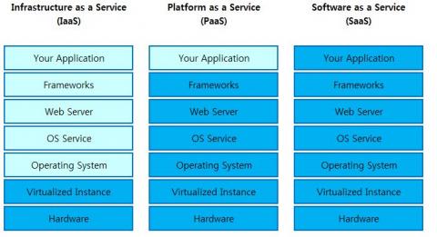
▶PaaS란 무엇인가?
PaaS는 개발자를 위한 일련의 서비스로, 개발자들이 기반 인프라스트럭처에 대해 신경 쓰지 않고 앱을 개발하고 테스트할 수 있게 해준다. 개발자들은 앱을 개발해 내놓는 과정에서 서버, 스토리지, 백업 프로비저닝에 대해 걱정하고 싶어하지 않는다. 그저 코드를 작성하고 앱을 테스트하고 출시한 후 지속적으로 버그를 수정하는 데 전념하고 싶어한다. 서버 설비와 관련된 모든 백엔드 작업은 자동으로, 개발자가 인지하지 못하는 사이에 백그라운드에서 이루어져야 하는데, PaaS의 역할이 바로 그것이다.
- IaaS(Infrastructure as a Service)> : 서버를 운영하기 위해서는 서버 자원, IP, Network, Storage, 전력 등등 인프라를 구축하기 위해 여러가지가 필요합니다. Iaas는 이러한 것들을 가상의 환경에서 쉽고 편하게 이용할 수 있게 서비스 형태로 제공합니다. Iass를 서비스로 제공하기 위해 기존 서버 호스팅보다 H/W 확장성이 좋고 탄력적이며 빠른 제공을 할 수 있는 가상화 기술을 이용합니다. Iass는 Pass, Saas의 기반이 되는 기술입니다.
- PasS(Platform as a Service) : 서비스를 개발 할 수 있는 안정적인 환경(Platform)과 그 환경을 이용하는 응용 프로그램을 개발 할 수 있는 API까지 제공하는 형태를 Paas라고 합니다.
- SaaS(Software as a Service) : Cloud환경에서 동작하는 응용프로그램을 서비스 형태로 제공하는 것을 Saas라고 합니다. 예를들어 메일 서비스를 들 수 있습니다. 사용자는 이 시스템이 무엇으로 이루어져 있고 어떻게 동작 하고 있는지 그리고 메일을 백업을 어떻게 하는지 알 필요가 없습니다. 그저 서비스 형태로 원하는 단말기(PC, Tablet, SmartPhone 등등)에서 메일을 주고 받으며, 필요하면 언제든지 공간도 늘려서 서비스를 받을 수 있기 때문입니다.
▶환경변수란?
원래 변수라는 것은, 특정 프로그램 안에서 어떤 값을 메모리에 저장해 놓을 때 쓰는 것입니다. 그런데 만약 컴퓨터 시스템의 전체적인 규모로, 어떤 간단한 값을 저장해 놓고, 여러 프로그램들이 그 값을 쉽게 참조하려면, 환경 변수를 많이 사용합니다.
데이터가 전달하는 과정에서 여러 네트워크들을 통과해야하는 경우가 생길 수 있다. 여러 네트워크들의 연결을 담당하고 있는 라우터 장비가 데이터의 목적지가 어디인지 확인하여 빠르고 정확한 길을 찾아 전달해주는 것을 Routing(라우팅)이라고 한다.
라우팅을 너무 어렵게 생각할 필요는 없다. 우리가 처음 가보는 장소를 찾아가기 위해 하는 모든 행동들을 라우터가 패킷을 전달하는 라우팅 과정에 비교해보면 쉽게 이해할 수 있다. 예를 들어 새로 생긴 맛집을 찾아가려고 한다는 가정을 해본다.
우리가 가장 먼저하는 것은 아마 그 곳이 어느 동네에 있는지 주소는 무엇인지를 확인하는 일일것이다. 그런 뒤에 목적지인 맛집이 있는 동네로 가기 위해 가장 편하고 빠른 교통수단과 경로는 어디인지를 생각할 것이다. 지하철을 타기로 했다면 몇호선을 어느 방면으로 타야하는지 정확한 방향을 확인한 후에 선택한 교통수단을 이용하여 목적지로 출발한다.
방금 위에서 본 과정을 라우터가 수신한 패킷을 전달하기 위한 과정으로 비교해서 생각해보자.
우리가 맛집의 정확한 위치를 파악하는 것 처럼 전달받은 패킷을 전달하기 위해 라우터도 가장 먼저 목적지가 어디인지 IP주소를 확인한다. 그런 뒤에 가장 빠른 경로가 어디인지를 확인하고 그 경로로 가기 위해서는 자신의 어느 인터페이스로 패킷을 내보내야 하는지 결정할 것이다. 그런 뒤에 결정한 인터페이스로 패킷을 전달하면 그 패킷은 또 다른 라우터로 전달되어 위와 같은 과정을 목적지 네트워크에 도착할 때 까지 반복할 것이다.
이처럼 데이터를 목적지까지 전달하기 위한 모든 일련의 과정을 통틀어 Routing이라고 한다.
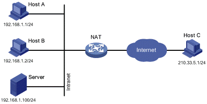
▶NAT(Network Address Translation, 네트워크 주소 변환
사설 아이피가 외부로 요청을 보낼 때 공용 아이피로 변환시켜 외부와 연결하던가, 반대로 외부로 요청이 들어올 때 공용 아이피로 받아 공용 아이피를 변환시켜 사설 아이피에 연결하는 기능을 한다.
패킷에 변화가 생기기 때문에 IP나 TCP/UDP의 체크섬(checksum)도 다시 계산되어 재기록해야 합니다. NAT를 이용하는 이유는 대개 사설 네트워크에 속한 여러 개의 호스트가 하나의 공인 IP 주소를 사용하여 인터넷에 접속하기 위함입니다. 많은 네트워크 관리자들이 NAT를 편리한 기법이라고 보고 널리 사용하고 있으며, NAT가 호스트 간의 통신에 있어서 복잡성을 증가시킬 수 있으므로 네트워크 성능에 영향을 줄 수 있는 것은 당연하다 볼 수 있습니다.
NAT는 IPv4의 주소 부족 문제를 해결하기 위한 방법으로서 고려되었으며, 주로 비공인(사설, local) 네트워크 주소를 사용하는 망에서 외부의 공인망(public, 예를 들면 인터넷)과의 통신을 위해서 네트워크 주소를 변환하는 것입니다.
즉 내부 망에서는 사설 IP 주소를 사용하여 통신을 하고, 외부망과의 통신시에는 NAT를 거쳐 공인 IP 주소로 자동 변환합니다.
▶패킷(packet)
패킷(packet)은 사전적인 의미로는 '한 다발, 한 묶음'을 뜻하는 말로 통신, 네트워크에서는 한 번에 전송하는 정보의 단위를 일컫습니다.
좀 더 설명드리자면 통신 등에서는 모든 데이터들을 이와 같은 패킷 단위로 잘게 쪼개어서 전송을 합니다. 매 패킷마다에는 받을 주소지와 데이터 본내용 그리고 에러체크 정보가 들어 있습니다.
그런데 왜 이와같이 잘게 쪼개냐구요?
그 이유는, 예를 들어 100MByte의 크기의 데이터를 전송하고자 할 때 이를 한꺼번에 1초에 1MByte 전송할 수 있는 회선에 보낸다고 칩시다. 그러면 받는 쪽에서는 뭐 대략 100초라는 시간이 걸릴 겁니다.
이렇게 한꺼번에 보내는 경우 아무런 에러없이 한번에 도달했다면 훨씬 효율적이긴 하겠지만 만약에 중간에 회선이 끊기거나 에러체크에 의해 잘못된 데이터가 중간에 1개만 끼었다는 것을 검출하게 되면 다시 처음부터 데이터를 받아야 할 겁니다. 그러면 다시 100초라는 시간을 버리게 됩니다.
반면에 데이터를 패킷단위로 잘게 쪼개어 보내게 되면 예를 들어 1MByte씩 (실제로는 훨씬 적습니다) 쪼갤 경우100번의 과정 즉, 1번패킷전송-수신체크-2번패킷전송-수신체크....... -100번패킷전송-수신체크-완료통보 라는 과정을 거쳐 통신이 이루어지는데 중간에 에러가 나더라도 해당하는 그 번호의 패킷만 재전송하면 되므로 훨씬 효율적이 됩니다.
이러한 이유로 대부분의 데이터 통신에서는 데이터를 패킷단위로 쪼개어 서로 주고 받고 있습니다.
참고로 패킷이 소프트웨어적인 측면에서의 묶음이라면 실제로 데이터를 주고 받는 네트워크 장비에서는 패킷을 다시 프레임이라고하는 역시 아주 작은 단위로 묶어서 신호를 처리하고 있습니다.프레임도 패킷과 같은 이치입니다.(출처: http://jwprogramming.tistory.com/30 [개발자를 꿈꾸는 프로그래머])
▶vpn vpn이란 공유네트워크 상에 사설네트워크를 구축하는 것 혹은 그러한 기술을 의미 합니다. 가상적인 전용선처럼 이용가능하기 때문에 Virtual(仮想的)한 Private Network(専用線)이라고 불립니다.
▶Ephemeral port
An ephemeral port is a short-lived transport protocol port for Internet Protocol (IP) communications. Ephemeral ports are allocated automatically from a predefined range by the IP stack software. An ephemeral port is typically used by the Transmission Control Protocol (TCP), User Datagram Protocol (UDP), or the Stream Control Transmission Protocol (SCTP) as the port assignment for the client end of a client–server communication to a well-known port on a server.
<!DOCTYPE html>가 문서의 가장 처음에 온것을 목격한 적이 있을 것이다. html은 시대와 이익집단에 따라 그 표준안이 유동적으로 변화하는데, 작성한 html문서가 어떤 표준안에 따라서 작성된 것인지를 웹브라우저가 이해할 수 있도록 기술하는 것이 필요하다. 이는 필수적이지않지만 작성한 코딩이 정확하게 동작시키기 위해서 표준안의 기준을 알리는 것이 좋다.
autoDefault value. The background-image contains its width and heightPlay it »
lengthSets the width and height of the background image. The first value sets the width, the second value sets the height. If only one value is given, the second is set to "auto"Play it »
percentageSets the width and height of the background image in percent of the parent element. The first value sets the width, the second value sets the height. If only one value is given, the second is set to "auto"Play it »
coverScale the background image to be as large as possible so that the background area is completely covered by the background image. Some parts of the background image may not be in view within the background positioning areaPlay it »
containScale the image to the largest size such that both its width and its height can fit inside the content areaPlay it »
initialSets this property to its default value. Read about initialPlay it »
inheritInherits this property from its parent element. Read about inherit
・background-position: bottom; : 백그라운드 이미지가 부모 엘리먼트를 기준으로 TOP,CENTER,BOTTOM중 어느곳에 위치할지를 지정하는 것이다. CENTER를 지정할 경우, 가로 세로 중앙에 위치하게 된다.
・background-repeat: no-repeat; : 백그라운드 이미지를 반복시킬 것인지 아닌지를 지정한다.
▶[css]padding과 margin의 차이
▶[css]width는 이미 화면 전체를 100%로 반영하고 있지만, height는 부모의 height를 100%로 산정한다.
<divid="outer"><divid="inner"><p>Where is pancakes house?</p></div></div>
#inner will grow to be tall enough to contain the paragraph and #outer will grow to be tall enough to contain #inner.
When you specify the height or width as a percentage, that's a percentage with respect to the element's parent. In the case of width, all block elements are, unless specified otherwise, as wide as their parent all the way back up to <html>; so, the width of a block element is independent of its content and saying width: 50% yields a well defined number of pixels.
However, the height of a block element depends on its content unless you specify a specific height. So there is feedback between the parent and child where height is concerned and saying height: 50% doesn't yield a well defined value unless you break the feedback loop by giving the parent element a specific height.
▶[css]블록엘리먼트의 위치 자체를 옮기기 : float 블록엘리먼트는 기본적으로 왼쪽 위에 붙어 있는데, 이 위치 자체를 옮기는 것이 float이다. 자세한 내용은 아래 사이트 참고.http://aboooks.tistory.com/72
[BOOTSTRAP]
▶[bootstrap]class="row"의 역할
부트스트랩에서 row클래스는 열의 구성을 잡기 위해 사용한다. 부트스트랩에서 하나의 row는 12개의 그리드로 나뉘어져 있는데, row 클래스 안에 그리드로 열을 구성해서 html의 편한 조작이 가능한 것이다. 예를 들면, ecol-md-6 는 992픽셀 보다 더 크거나 스크린과 동일 사이즈 일때 12그리드중 6 그리드를 차지한다. col-md-4 일 경우에는 12그리드중 4 그리드를 차지한다.
▶[bootstrap]테이블에서 열의 크기를 class="col~~"로 맞추고 싶을 때
row class from your <tr> elements should be removed. That class makes a non-table-row element look like a table-row and adds some styles that break a standard <tr>. You can still use the "col" classes like normal:(https://stackoverflow.com/questions/18614171/how-to-use-bootstrap-3-grid-system-with-table-component)
▶블록안에서 택스트를 블록의 중앙에 위치시키고 싶을 때
Change the alignment of elements with the vertical-alignmentutilities. Please note that vertical-align only affects inline, inline-block, inline-table, and table cell elements.
- 화면에 필요한 모든 요소(css, js, image, iframe etc..)들이 웹 브라우저 메모리에 모두 올려진 다음에 실행됨
- 화면이 모두 그려진 다음의 메세징이나 이미지가 관련 요소가 모두 올려진 다음의 애니메이션에 적합함
- 전체 페이지의 모든 외부 리소스와 이미지가 브러우저에 불려운 이후 작동하게 되어 이미지가 안뜨너가 딜레이가 생길 때에는 그만큼의 시간을 기다려야 함
- 외부 링크나 파일 인크루트시 그 안에 window.load 스크립트가 있으면 둘 중 하나만 적용됨
- body onload 이벤트와 같이 body에서 onload 이벤트를 쓰게 되면 모든 window.load() 가 실행되지 않는 현상이 발생함(http://jinolog.com/programming/javascript/2011/03/21/jquery-ready-function.html)
・$(document).ready(callback)
- 외부 리소스. 이미지와는 상관 없이 브라우저가 DOM (document object model=html이라고 봐도 무관) 트리를 생성한 직후 실행
- window.load() 보다 더 빠르게 실행되고 중복 사용하여 실행해도 선언한 순서대로 실행됨
* $(function() 대신 $(document).ready() 를 권장하는 이유
$(function() 을 쓰나 $(document).ready() 를 쓰나 같은 함수임에는 틀림이 없으나
$(window).load() 함수와 확실하게 구분지어주기 위해 $(document).ready() 를 사용하는 것을 권장한다.\
자바스크립트를 포함하는 <script>태그를 DOM가장 아래에 적으면, 사실 필요없다.
・$(document).on(event,selector,callback)★★
-이벤트가 발생하는 시점에서의 DOM을 기준으로 콜백의 동작을 행하기 때문에, DOM의 변화가 예상될 이후의 코드는 위 코드로 구현해야 한다.
위의 예에서는 이미지 위에서 마우스가 움직일 때, 가로로 움직일 때는 반응하지 않고 세로로 움직일 때만 반응하게 하기 위해 width관련 라인은 코멘트처리했다.
-$(window).height():특정한 셀렉터를 지정하지 않고 window를 지정하면 열려있는 브라우저를 가르키케 되므로,브라우저 전체의 높이를 의미한다.
-$(".main-cover").mousemove(function(event){}):해당 셀렉터에 마우스의 움직임이 있을 때, 그 움직임 하나하나가 이벤트로써 event에 들어가게 된다.
-event.pageX:현재 마우스 좌표의 X축(The mouse position relative to the left edge of the document.)
event.pageY:현재 마우스 좌표의 Y축(The mouse position relative to the top edge of the document.)
-$('.main-cover').css():Get the value of a computed style property for the first element in the set of matched elements or set one or more CSS properties for every matched element.
-전체적인 코드를 설명 : 1.이미지위에 마우스 움직임이 감지 되었을 때 2.마우스 위치가 event에 격납되고 3. event의 좌표를 출력하여, 4.움직인 만큼 css의 background-position에서 위아래, 좌우의 위치를 바꾼다.
-$( window ).scroll(function(event) {}):셀렉터를 window로 설정하였으므로 셀렉터는 브라우저 전체가 된다. 브라우저의 스크롤의 움직임이 있을때, 그 움직임 하나하나가 이벤트로써 event에 들어가게 된다.
-$(window).scrollTop():Get the current vertical position of the scroll bar for the first element in the set of matched elements or set the vertical position of the scroll bar for every matched element.
-전체적인 코드 설명 : 1.브라우저에서 스크롤의 움직임이 있을 때마다, 그 움직임에 event로 들어간다. 2.브라우저의 스크롤 위치를 scrollTop이 감지하여 반환한다. 3.움직인 만큼 css의 background-position에서 위아래, 좌우의 위치를 바꾼다.
▶[jQuery]setInterval으로 계속 변하는 백그라운드 이미지 만들기
setInterval은 지정한 시간 간격을 기준으로 콜백을 무한히 불러오게 된다.
1
2
3
4
5
6
7
8
9
10
11
12
13
$(function () {
//console.log(result);
var i =0;
var images=['/image/logo/lookAtLogoBlack-White.jpg','/image/logo/lookAtLogoWhite-Black.jpg'];
offset메서드는 이벤트가 걸려 있는 DOM객체를 기준으로 좌표를 출력합니다. 이와 비슷한 메서드로 layer가 있습니다. 이 메서드는 현재 파이어폭스에서만 사용합니다.( 화면 중간에 있는 박스 내부에서 클릭한 위치를 찾을 때 해당 박스의 왼쪽 모서리 좌표가 0이됩니다. 화면의 기준이 아닙니다)
screen메서드는 화면 출력 크기(자신의 모니터)가 기준인 절대 좌표입니다. 브라우저를 움직여도 값은 같습니다.
client메서드는 브라우저가 기준인 좌표입니다. 현재 보이는 브라우저 화면 상에서 어느 지점에 위치하는 지를 의미하기 때문에 스크롤 해도 값은 변하지 않습니다.
page메서드는 문서가 기준입니다. client와 비슷하지만 이 메서드는 문서 전체 크기가 기준이라 스크롤 시 값이 바뀝니다. (스크롤을 포함해서 측정합니다)
▶[NODEJS]app.use(bodyParser.json())와 .bodyParser.urlencoded({extended: ...})의 의미
my research shows me that if extended: true, then you can parse nested objects, or generally any type. However, if you set extended: false, then you can only parse strings or arrays.
app.use(bodyParser.json()) basically tells the system that you want json to be used
.bodyParser.urlencoded({extended: ...})basically tells the system whether you want to use a simple algorithm for shallow parsing (i.e. false) or complex algorithm for deep parsing that can deal with nested objects (i.e. true).
▶[NODEJS]동기적으로 request하는 var sync_request = require('sync-request') 모듈
[NGINX]
▶[NGINX]NGINX를 통한 웹사이트 포워딩의 로직
서버 쪽 nodejs 파일에서 5200번 포트를 열고 외부에서 123.42.11.23:5100으로 접근하는 것처럼 외부에서 서버의 포트로 직접 접근하는 것은 보안상 위험한 일이다. 이를 해결하기 위한 방법으로 node의 WAS인 NGINX를 사용한다. 큰 로직의 흐름을 보면,
1. 외부에서 들어오는 디폴트 포트(80)에 대한 요청은 모두 NGINX가 받는다.
2. nodejs는 서버 내부의 localhost 서버 127.0.0.1의 특정포트, 예를들어 3000번에만 응답한다.
3. NGINX가 서버내부응답(127.0.0.1:3000)을 계속 지켜보고 있다가 외부의 요청이 들어오면, 그 요청에 서버내부(127.0.0.1:3000)에서 발생하는 node의 레스폰을 외부로 포워딩한다.
[JSON] ▶[JSON]json을 서버에서 불러오고 불러낼 때의 주의점:로컬에 저장된 json은 ""베이스다! -json은 .json 확장자로 존재할 때 String 형식이다. 이것을 자바스크립트로 불러올 때, require('json패스')로 객체화 하여 들고오고, 다시 json확장자로 보낼 때 JSON.stringify으로 String 화 하여 내보낸다. -json은 .json 확장자로 존재할 때 String 형식으로 존재하기 때문에 모든 키와 벨류값이 ""(더블쿼테이션)으로 감싸져 있다. 그렇지 않으면 자바에서 불러올 때 오류가 발생한다.
-json은 value값으로 multi line을 지정할 수 없다.
ex]
{ "key1":"hahaha
hohoho
bububu"} 불가
→
{ "key1":"hahaha \n hohoho \nbububu"} 가능
-JSON.parse(obj)를 사용하기 위해서는 obj가 ''로 둘러쌓인 string 이여야 한다.
1
2
3
var obj ='{"success":1,"data":{"sell":"1917702","buy":"1906011","high":"2020731","low":"1803078","last":"1906011","vol":"304.2223","timestamp":1515477721405}}';
▶[AJAX]html에 필요한 글을 일일이 쓰지 않고, AJAX를 이용해 서버에서 전달해주기
이렇게 하는 이유는 유지보수의 편리성을 위해서인데, 글의 내용이 바뀔 때 유지보수가 매우 빠르다는 장점이 있다. 특히 다양한 언어를 제공해주는 사이트를 운영할 때 매우 편리하다. i18n이라는 속성을 태그에 넣고, 그 속성값으로 제이슨의 키값을 넣어 제이슨과 매칭시키는 방법을 사용하고 있다.
-> winScp을 통한 파일 전송 (http://valuefactory.tistory.com/161)
-> AWS 포트 열기
-> 도메인 설정(http://valuefactory.tistory.com/166?category=765150)
-> Nginx 설치 -> 설정파일을 통해 외부 도메인에서 오는 요청을 서버 로컬의 노드로 응답(http://valuefactory.tistory.com/165?category=765151)
[NGINX]
▶config파일의 설정이 변경되면 아래와 같은 명령어로 재실행을 해주어야함
sudo /etc/init.d/nginx restart
혹은sudo service nginx reload
[SERVER ETC]
▶Tomcat과 Servlet, JSP의 관계
Servlet과 JSP는 PHP와 ASP와 같이 서버에서 동작하며 DB에 접근하든지 비지니스 로직처리를 수행하기 위한 Java언어를 사용하는 Server Side Script 언어이다.
Tomcat은 웹서버상에서 Java코드를 이용하기 위한 엔진 혹은 컨테이너이다. 즉, Java기반인 JSP, Servlet을 이해하기 위해 Tomcat과 같은 자바를 이용하는 엔진이 필요한 것이다.
→http프로토콜로 받은 클라이언트의 요청을 받아 자바가 이해할 수 있는 방식으로 servlet 클래스에 전달해 주는 역할을 한다. 또 반대로 java를 받아서 http프로토콜이 이해할 수 있도록 레스폰하는 역할도 한다.
Servlet은 Tomcat이 이해할 수 있는 순수 Java 코드로만 이루어진 웹서버용 클래스이다. 일반적인 Java 코드와 같으며 HTML형태로 출력하기 위해 print() 메소드 같은 것을 사용한다. 이 때문에 Servlet은 PHP와 ASP에 비해 코딩하기가 복잡하다. 이러한 단점을 보완하기 위해 나온것이 JSP이다. JSP는 PHP나 ASP처럼 HTML코드와 혼용되서 사용한다. Tomcat은 JSP코드를 컴파일할때 Servlet코드로 전환하여 컴파일을 진행하게 된다. 그래서 Tomcat을 Servlet/JSP 컨테이너라고 한다.
▶MVC모델
Controller
사용자가 접근 한 URL에 따라서 사용자의 요청사항을 파악한 후에 그 요청에 맞는 데이터를 Model에 의뢰하고, 데이터를 View에 반영해서 사용자에게 알려준다.
Model
일반적으로 CI의 모델은 데이터베이스 테이블에 대응된다. 이를테면 Topic이라는 테이블은 topic_model이라는 Model을 만든다. 그런데 이 관계가 강제적이지 않기 때문에 규칙을 일관성 있게 정의하는 것이 필요하다.
View
View는 클라이언트 측 기술인 html/css/javascript들을 모아둔 컨테이너이다.
This comprehensive primer on the internal operations of WebKit and Gecko is the result of much research done by Israeli developer Tali Garsiel. Over a few years, she reviewed all the published data about browser internals (see Resources) and spent a lot of time reading web browser source code. She wrote:
In the years of IE 90% dominance there was nothing much to do but regard the browser as a "black box", but now, with open source browsers having more than half of the usage share, it's a good time to take a peek under the engine's hood and see what's inside a web browser. Well, what's inside are millions of C++ lines...
Tali published her research on her site, but we knew it deserved a larger audience, so we've cleaned it up and republished it here.
As a web developer, learning the internals of browser operations helps you make better decisions and know the justifications behind development best practices. While this is a rather lengthy document, we recommend you spend some time digging in; we guarantee you'll be glad you did. Paul Irish, Chrome Developer Relations
Web browsers are the most widely used software. In this primer, I will explain how they work behind the scenes. We will see what happens when you type google.com in the address bar until you see the Google page on the browser screen.
There are five major browsers used on desktop today: Chrome, Internet Explorer, Firefox, Safari and Opera. On mobile, the main browsers are Android Browser, iPhone, Opera Mini and Opera Mobile, UC Browser, the Nokia S40/S60 browsers and Chrome–all of which, except for the Opera browsers, are based on WebKit. I will give examples from the open source browsers Firefox and Chrome, and Safari (which is partly open source). According to StatCounter statistics (as of June 2013) Chrome, Firefox and Safari make up around 71% of global desktop browser usage. On mobile, Android Browser, iPhone and Chrome constitute around 54% of usage.
The browser's main functionality
The main function of a browser is to present the web resource you choose, by requesting it from the server and displaying it in the browser window. The resource is usually an HTML document, but may also be a PDF, image, or some other type of content. The location of the resource is specified by the user using a URI (Uniform Resource Identifier).
The way the browser interprets and displays HTML files is specified in the HTML and CSS specifications. These specifications are maintained by the W3C (World Wide Web Consortium) organization, which is the standards organization for the web. For years browsers conformed to only a part of the specifications and developed their own extensions. That caused serious compatibility issues for web authors. Today most of the browsers more or less conform to the specifications.
Browser user interfaces have a lot in common with each other. Among the common user interface elements are:
Address bar for inserting a URI
Back and forward buttons
Bookmarking options
Refresh and stop buttons for refreshing or stopping the loading of current documents
Home button that takes you to your home page
Strangely enough, the browser's user interface is not specified in any formal specification, it just comes from good practices shaped over years of experience and by browsers imitating each other. The HTML5 specification doesn't define UI elements a browser must have, but lists some common elements. Among those are the address bar, status bar and tool bar. There are, of course, features unique to a specific browser like Firefox's downloads manager.
The user interface: this includes the address bar, back/forward button, bookmarking menu, etc. Every part of the browser display except the window where you see the requested page.
The browser engine: marshals actions between the UI and the rendering engine.
The rendering engine : responsible for displaying requested content. For example if the requested content is HTML, the rendering engine parses HTML and CSS, and displays the parsed content on the screen.
Networking: for network calls such as HTTP requests, using different implementations for different platform behind a platform-independent interface.
UI backend: used for drawing basic widgets like combo boxes and windows. This backend exposes a generic interface that is not platform specific. Underneath it uses operating system user interface methods.
JavaScript interpreter. Used to parse and execute JavaScript code.
Data storage. This is a persistence layer. The browser may need to save all sorts of data locally, such as cookies. Browsers also support storage mechanisms such as localStorage, IndexedDB, WebSQL and FileSystem.
Figure : Browser components
It is important to note that browsers such as Chrome run multiple instances of the rendering engine: one for each tab. Each tab runs in a separate process.
The rendering engine
The responsibility of the rendering engine is well... Rendering, that is display of the requested contents on the browser screen.
By default the rendering engine can display HTML and XML documents and images. It can display other types of data via plug-ins or extension; for example, displaying PDF documents using a PDF viewer plug-in. However, in this chapter we will focus on the main use case: displaying HTML and images that are formatted using CSS.
Rendering engines
Different browsers use different rendering engines: Internet Explorer uses Trident, Firefox uses Gecko, Safari uses WebKit. Chrome and Opera (from version 15) use Blink, a fork of WebKit.
WebKit is an open source rendering engine which started as an engine for the Linux platform and was modified by Apple to support Mac and Windows. See webkit.org for more details.
The main flow
The rendering engine will start getting the contents of the requested document from the networking layer. This will usually be done in 8kB chunks.
After that, this is the basic flow of the rendering engine:
Figure : Rendering engine basic flow
The rendering engine will start parsing the HTML document and convert elements to DOM nodes in a tree called the "content tree". The engine will parse the style data, both in external CSS files and in style elements. Styling information together with visual instructions in the HTML will be used to create another tree: the render tree.
The render tree contains rectangles with visual attributes like color and dimensions. The rectangles are in the right order to be displayed on the screen.
After the construction of the render tree it goes through a "layout" process. This means giving each node the exact coordinates where it should appear on the screen. The next stage is painting–the render tree will be traversed and each node will be painted using the UI backend layer.
It's important to understand that this is a gradual process. For better user experience, the rendering engine will try to display contents on the screen as soon as possible. It will not wait until all HTML is parsed before starting to build and layout the render tree. Parts of the content will be parsed and displayed, while the process continues with the rest of the contents that keeps coming from the network.
Main flow examples
Figure : WebKit main flowFigure : Mozilla's Gecko rendering engine main flow (3.6)
From figures 3 and 4 you can see that although WebKit and Gecko use slightly different terminology, the flow is basically the same.
Gecko calls the tree of visually formatted elements a "Frame tree". Each element is a frame. WebKit uses the term "Render Tree" and it consists of "Render Objects". WebKit uses the term "layout" for the placing of elements, while Gecko calls it "Reflow". "Attachment" is WebKit's term for connecting DOM nodes and visual information to create the render tree. A minor non-semantic difference is that Gecko has an extra layer between the HTML and the DOM tree. It is called the "content sink" and is a factory for making DOM elements. We will talk about each part of the flow:
Parsing–general
Since parsing is a very significant process within the rendering engine, we will go into it a little more deeply. Let's begin with a little introduction about parsing.
Parsing a document means translating it to a structure the code can use. The result of parsing is usually a tree of nodes that represent the structure of the document. This is called a parse tree or a syntax tree.
For example, parsing the expression 2 + 3 - 1 could return this tree:
Figure : mathematical expression tree node
Grammars
Parsing is based on the syntax rules the document obeys: the language or format it was written in. Every format you can parse must have deterministic grammar consisting of vocabulary and syntax rules. It is called a context free grammar. Human languages are not such languages and therefore cannot be parsed with conventional parsing techniques.
Parser–Lexer combination
Parsing can be separated into two sub processes: lexical analysis and syntax analysis.
Lexical analysis is the process of breaking the input into tokens. Tokens are the language vocabulary: the collection of valid building blocks. In human language it will consist of all the words that appear in the dictionary for that language.
Syntax analysis is the applying of the language syntax rules.
Parsers usually divide the work between two components: the lexer (sometimes called tokenizer) that is responsible for breaking the input into valid tokens, and the parser that is responsible for constructing the parse tree by analyzing the document structure according to the language syntax rules. The lexer knows how to strip irrelevant characters like white spaces and line breaks.
Figure : from source document to parse trees
The parsing process is iterative. The parser will usually ask the lexer for a new token and try to match the token with one of the syntax rules. If a rule is matched, a node corresponding to the token will be added to the parse tree and the parser will ask for another token.
If no rule matches, the parser will store the token internally, and keep asking for tokens until a rule matching all the internally stored tokens is found. If no rule is found then the parser will raise an exception. This means the document was not valid and contained syntax errors.
Translation
In many cases the parse tree is not the final product. Parsing is often used in translation: transforming the input document to another format. An example is compilation. The compiler that compiles source code into machine code first parses it into a parse tree and then translates the tree into a machine code document.
Figure : compilation flow
Parsing example
In figure 5 we built a parse tree from a mathematical expression. Let's try to define a simple mathematical language and see the parse process.
Vocabulary: Our language can include integers, plus signs and minus signs.
Syntax:
The language syntax building blocks are expressions, terms and operations.
Our language can include any number of expressions.
An expression is defined as a "term" followed by an "operation" followed by another term
An operation is a plus token or a minus token
A term is an integer token or an expression
Let's analyze the input 2 + 3 - 1. The first substring that matches a rule is 2: according to rule #5 it is a term. The second match is 2 + 3: this matches the third rule: a term followed by an operation followed by another term. The next match will only be hit at the end of the input. 2 + 3 - 1 is an expression because we already know that 2 + 3 is a term, so we have a term followed by an operation followed by another term. 2 + +will not match any rule and therefore is an invalid input.
As you see, integers are defined by a regular expression.
Syntax is usually defined in a format called BNF. Our language will be defined as:
expression :=  term  operation  term
operation :=  PLUS | MINUS
term := INTEGER | expression
We said that a language can be parsed by regular parsers if its grammar is a context free grammar. An intuitive definition of a context free grammar is a grammar that can be entirely expressed in BNF. For a formal definition seeWikipedia's article on Context-free grammar
Types of parsers
There are two types of parsers: top down parsers and bottom up parsers. An intuitive explanation is that top down parsers examine the high level structure of the syntax and try to find a rule match. Bottom up parsers start with the input and gradually transform it into the syntax rules, starting from the low level rules until high level rules are met.
Let's see how the two types of parsers will parse our example.
The top down parser will start from the higher level rule: it will identify 2 + 3 as an expression. It will then identify 2 + 3 - 1 as an expression (the process of identifying the expression evolves, matching the other rules, but the start point is the highest level rule).
The bottom up parser will scan the input until a rule is matched. It will then replace the matching input with the rule. This will go on until the end of the input. The partly matched expression is placed on the parser's stack.
Stack
Input
2 + 3 - 1
term
+ 3 - 1
term operation
3 - 1
expression
- 1
expression operation
1
expression
-
This type of bottom up parser is called a shift-reduce parser, because the input is shifted to the right (imagine a pointer pointing first at the input start and moving to the right) and is gradually reduced to syntax rules.
Generating parsers automatically
There are tools that can generate a parser. You feed them the grammar of your language–its vocabulary and syntax rules–and they generate a working parser. Creating a parser requires a deep understanding of parsing and it's not easy to create an optimized parser by hand, so parser generators can be very useful.
WebKit uses two well known parser generators: Flex for creating a lexer and Bisonfor creating a parser (you might run into them with the names Lex and Yacc). Flex input is a file containing regular expression definitions of the tokens. Bison's input is the language syntax rules in BNF format.
HTML Parser
The job of the HTML parser is to parse the HTML markup into a parse tree.
The HTML grammar definition
The vocabulary and syntax of HTML are defined in specifications created by the W3C organization.
Not a context free grammar
As we have seen in the parsing introduction, grammar syntax can be defined formally using formats like BNF.
Unfortunately all the conventional parser topics do not apply to HTML (I didn't bring them up just for fun–they will be used in parsing CSS and JavaScript). HTML cannot easily be defined by a context free grammar that parsers need.
There is a formal format for defining HTML–DTD (Document Type Definition)–but it is not a context free grammar.
This appears strange at first sight; HTML is rather close to XML. There are lots of available XML parsers. There is an XML variation of HTML–XHTML–so what's the big difference?
The difference is that the HTML approach is more "forgiving": it lets you omit certain tags (which are then added implicitly), or sometimes omit start or end tags, and so on. On the whole it's a "soft" syntax, as opposed to XML's stiff and demanding syntax.
This seemingly small detail makes a world of a difference. On one hand this is the main reason why HTML is so popular: it forgives your mistakes and makes life easy for the web author. On the other hand, it makes it difficult to write a formal grammar. So to summarize, HTML cannot be parsed easily by conventional parsers, since its grammar is not context free. HTML cannot be parsed by XML parsers.
HTML DTD
HTML definition is in a DTD format. This format is used to define languages of the SGML family. The format contains definitions for all allowed elements, their attributes and hierarchy. As we saw earlier, the HTML DTD doesn't form a context free grammar.
There are a few variations of the DTD. The strict mode conforms solely to the specifications but other modes contain support for markup used by browsers in the past. The purpose is backwards compatibility with older content. The current strict DTD is here: www.w3.org/TR/html4/strict.dtd
DOM
The output tree (the "parse tree") is a tree of DOM element and attribute nodes. DOM is short for Document Object Model. It is the object presentation of the HTML document and the interface of HTML elements to the outside world like JavaScript. The root of the tree is the "Document" object.
The DOM has an almost one-to-one relation to the markup. For example:
<html><body><p>
Hello World
</p><div><imgsrc="example.png"/></div></body></html>
This markup would be translated to the following DOM tree:Figure : DOM tree of the example markup
When I say the tree contains DOM nodes, I mean the tree is constructed of elements that implement one of the DOM interfaces. Browsers use concrete implementations that have other attributes used by the browser internally.
The parsing algorithm
As we saw in the previous sections, HTML cannot be parsed using the regular top down or bottom up parsers.
The reasons are:
The forgiving nature of the language.
The fact that browsers have traditional error tolerance to support well known cases of invalid HTML.
The parsing process is reentrant. For other languages, the source doesn't change during parsing, but in HTML, dynamic code (such as script elements containing document.write() calls) can add extra tokens, so the parsing process actually modifies the input.
Unable to use the regular parsing techniques, browsers create custom parsers for parsing HTML.
Tokenization is the lexical analysis, parsing the input into tokens. Among HTML tokens are start tags, end tags, attribute names and attribute values.
The tokenizer recognizes the token, gives it to the tree constructor, and consumes the next character for recognizing the next token, and so on until the end of the input.
Figure : HTML parsing flow (taken from HTML5 spec)
The tokenization algorithm
The algorithm's output is an HTML token. The algorithm is expressed as a state machine. Each state consumes one or more characters of the input stream and updates the next state according to those characters. The decision is influenced by the current tokenization state and by the tree construction state. This means the same consumed character will yield different results for the correct next state, depending on the current state. The algorithm is too complex to describe fully, so let's see a simple example that will help us understand the principle.
Basic example–tokenizing the following HTML:
<html><body>
Hello world
</body></html>
The initial state is the "Data state". When the < character is encountered, the state is changed to "Tag open state". Consuming an a-z character causes creation of a "Start tag token", the state is changed to "Tag name state". We stay in this state until the > character is consumed. Each character is appended to the new token name. In our case the created token is an html token.
When the > tag is reached, the current token is emitted and the state changes back to the "Data state". The <body> tag will be treated by the same steps. So far the html and body tags were emitted. We are now back at the "Data state". Consuming the H character of Hello world will cause creation and emitting of a character token, this goes on until the < of </body> is reached. We will emit a character token for each character of Hello world.
We are now back at the "Tag open state". Consuming the next input / will cause creation of an end tag token and a move to the "Tag name state". Again we stay in this state until we reach >.Then the new tag token will be emitted and we go back to the "Data state". The </html> input will be treated like the previous case.
Figure : Tokenizing the example input
Tree construction algorithm
When the parser is created the Document object is created. During the tree construction stage the DOM tree with the Document in its root will be modified and elements will be added to it. Each node emitted by the tokenizer will be processed by the tree constructor. For each token the specification defines which DOM element is relevant to it and will be created for this token. The element is added to the DOM tree, and also the stack of open elements. This stack is used to correct nesting mismatches and unclosed tags. The algorithm is also described as a state machine. The states are called "insertion modes".
Let's see the tree construction process for the example input:
<html><body>
Hello world
</body></html>
The input to the tree construction stage is a sequence of tokens from the tokenization stage. The first mode is the "initial mode". Receiving the "html" token will cause a move to the "before html" mode and a reprocessing of the token in that mode. This will cause creation of the HTMLHtmlElement element, which will be appended to the root Document object.
The state will be changed to "before head". The "body" token is then received. An HTMLHeadElement will be created implicitly although we don't have a "head" token and it will be added to the tree.
We now move to the "in head" mode and then to "after head". The body token is reprocessed, an HTMLBodyElement is created and inserted and the mode is transferred to "in body".
The character tokens of the "Hello world" string are now received. The first one will cause creation and insertion of a "Text" node and the other characters will be appended to that node.
The receiving of the body end token will cause a transfer to "after body" mode. We will now receive the html end tag which will move us to "after after body"mode. Receiving the end of file token will end the parsing.
Figure : tree construction of example html
Actions when the parsing is finished
At this stage the browser will mark the document as interactive and start parsing scripts that are in "deferred" mode: those that should be executed after the document is parsed. The document state will be then set to "complete" and a "load" event will be fired.
You never get an "Invalid Syntax" error on an HTML page. Browsers fix any invalid content and go on.
Take this HTML for example:
<html><mytag></mytag><div><p></div>
Really lousy HTML
</p></html>
I must have violated about a million rules ("mytag" is not a standard tag, wrong nesting of the "p" and "div" elements and more) but the browser still shows it correctly and doesn't complain. So a lot of the parser code is fixing the HTML author mistakes.
Error handling is quite consistent in browsers, but amazingly enough it hasn't been part of HTML specifications. Like bookmarking and back/forward buttons it's just something that developed in browsers over the years. There are known invalid HTML constructs repeated on many sites, and the browsers try to fix them in a way conformant with other browsers.
The HTML5 specification does define some of these requirements. (WebKit summarizes this nicely in the comment at the beginning of the HTML parser class.)
The parser parses tokenized input into the document, building up the document tree. If the document is well-formed, parsing it is straightforward.
Unfortunately, we have to handle many HTML documents that are not well-formed, so the parser has to be tolerant about errors.
We have to take care of at least the following error conditions:
The element being added is explicitly forbidden inside some outer tag. In this case we should close all tags up to the one which forbids the element, and add it afterwards.
We are not allowed to add the element directly. It could be that the person writing the document forgot some tag in between (or that the tag in between is optional). This could be the case with the following tags: HTML HEAD BODY TBODY TR TD LI (did I forget any?).
We want to add a block element inside an inline element. Close all inline elements up to the next higher block element.
If this doesn't help, close elements until we are allowed to add the element–or ignore the tag.
Let's see some WebKit error tolerance examples:
</br> instead of <br>
Some sites use </br> instead of <br>. In order to be compatible with IE and Firefox, WebKit treats this like <br>. The code:
www.liceo.edu.mx is an example of a site that achieves a level of nesting of about 1500 tags, all from a bunch of <b>s. We will only allow at most 20 nested tags of the same type before just ignoring them all together.
boolHTMLParser::allowNestedRedundantTag(constAtomicString& tagName){unsigned i =0;for(HTMLStackElem* curr = m_blockStack;
i < cMaxRedundantTagDepth && curr && curr->tagName == tagName;
curr = curr->next, i++){}return i != cMaxRedundantTagDepth;}
Misplaced html or body end tags
Again–the comment speaks for itself.
Support for really broken HTML. We never close the body tag, since some stupid web pages close it before the actual end of the doc. Let's rely on the end() call to close things.
So web authors beware–unless you want to appear as an example in a WebKit error tolerance code snippet–write well formed HTML.
CSS parsing
Remember the parsing concepts in the introduction? Well, unlike HTML, CSS is a context free grammar and can be parsed using the types of parsers described in the introduction. In fact the CSS specification defines CSS lexical and syntax grammar.
Let's see some examples: The lexical grammar (vocabulary) is defined by regular expressions for each token:
comment   \/\*[^*]*\*+([^/*][^*]*\*+)*\/
num   [0-9]+|[0-9]*"."[0-9]+
nonascii  [\200-\377]
nmstart   [_a-z]|{nonascii}|{escape}
nmchar    [_a-z0-9-]|{nonascii}|{escape}
name    {nmchar}+
ident   {nmstart}{nmchar}*
"ident" is short for identifier, like a class name. "name" is an element id (that is referred by "#" )
div.error and a.error are selectors. The part inside the curly braces contains the rules that are applied by this ruleset. This structure is defined formally in this definition:
This means a ruleset is a selector or optionally a number of selectors separated by a comma and spaces (S stands for white space). A ruleset contains curly braces and inside them a declaration or optionally a number of declarations separated by a semicolon. "declaration" and "selector" will be defined in the following BNF definitions.
WebKit CSS parser
WebKit uses Flex and Bison parser generators to create parsers automatically from the CSS grammar files. As you recall from the parser introduction, Bison creates a bottom up shift-reduce parser. Firefox uses a top down parser written manually. In both cases each CSS file is parsed into a StyleSheet object. Each object contains CSS rules. The CSS rule objects contain selector and declaration objects and other objects corresponding to CSS grammar.
Figure : parsing CSS
The order of processing scripts and style sheets
Scripts
The model of the web is synchronous. Authors expect scripts to be parsed and executed immediately when the parser reaches a <script> tag. The parsing of the document halts until the script has been executed. If the script is external then the resource must first be fetched from the network–this is also done synchronously, and parsing halts until the resource is fetched. This was the model for many years and is also specified in HTML4 and 5 specifications. Authors can add the "defer" attribute to a script, in which case it will not halt document parsing and will execute after the document is parsed. HTML5 adds an option to mark the script as asynchronous so it will be parsed and executed by a different thread.
Speculative parsing
Both WebKit and Firefox do this optimization. While executing scripts, another thread parses the rest of the document and finds out what other resources need to be loaded from the network and loads them. In this way, resources can be loaded on parallel connections and overall speed is improved. Note: the speculative parser only parses references to external resources like external scripts, style sheets and images: it doesn't modify the DOM tree–that is left to the main parser.
Style sheets
Style sheets on the other hand have a different model. Conceptually it seems that since style sheets don't change the DOM tree, there is no reason to wait for them and stop the document parsing. There is an issue, though, of scripts asking for style information during the document parsing stage. If the style is not loaded and parsed yet, the script will get wrong answers and apparently this caused lots of problems. It seems to be an edge case but is quite common. Firefox blocks all scripts when there is a style sheet that is still being loaded and parsed. WebKit blocks scripts only when they try to access certain style properties that may be affected by unloaded style sheets.
Render tree construction
While the DOM tree is being constructed, the browser constructs another tree, the render tree. This tree is of visual elements in the order in which they will be displayed. It is the visual representation of the document. The purpose of this tree is to enable painting the contents in their correct order.
Firefox calls the elements in the render tree "frames". WebKit uses the term renderer or render object. A renderer knows how to lay out and paint itself and its children. WebKit's RenderObject class, the base class of the renderers, has the following definition:
classRenderObject{virtualvoid layout();virtualvoid paint(PaintInfo);virtualvoid rect repaintRect();Node* node;//the DOM nodeRenderStyle* style;// the computed styleRenderLayer* containgLayer;//the containing z-index layer}
Each renderer represents a rectangular area usually corresponding to a node's CSS box, as described by the CSS2 spec. It includes geometric information like width, height and position. The box type is affected by the "display" value of the style attribute that is relevant to the node (see the style computation section). Here is WebKit code for deciding what type of renderer should be created for a DOM node, according to the display attribute:
RenderObject*RenderObject::createObject(Node* node,RenderStyle* style){Document* doc = node->document();RenderArena* arena = doc->renderArena();...RenderObject* o =0;switch(style->display()){case NONE:break;case INLINE:
o =new(arena)RenderInline(node);break;case BLOCK:
o =new(arena)RenderBlock(node);break;case INLINE_BLOCK:
o =new(arena)RenderBlock(node);break;case LIST_ITEM:
o =new(arena)RenderListItem(node);break;...}return o;}
The element type is also considered: for example, form controls and tables have special frames. In WebKit if an element wants to create a special renderer, it will override the createRenderer() method. The renderers point to style objects that contains non geometric information.
The render tree relation to the DOM tree
The renderers correspond to DOM elements, but the relation is not one to one. Non-visual DOM elements will not be inserted in the render tree. An example is the "head" element. Also elements whose display value was assigned to "none" will not appear in the tree (whereas elements with "hidden" visibility will appear in the tree).
There are DOM elements which correspond to several visual objects. These are usually elements with complex structure that cannot be described by a single rectangle. For example, the "select" element has three renderers: one for the display area, one for the drop down list box and one for the button. Also when text is broken into multiple lines because the width is not sufficient for one line, the new lines will be added as extra renderers. Another example of multiple renderers is broken HTML. According to the CSS spec an inline element must contain either only block elements or only inline elements. In the case of mixed content, anonymous block renderers will be created to wrap the inline elements.
Some render objects correspond to a DOM node but not in the same place in the tree. Floats and absolutely positioned elements are out of flow, placed in a different part of the tree, and mapped to the real frame. A placeholder frame is where they should have been.
Figure : The render tree and the corresponding DOM tree (3.1). The "Viewport" is the initial containing block. In WebKit it will be the "RenderView" object
The flow of constructing the tree
In Firefox, the presentation is registered as a listener for DOM updates. The presentation delegates frame creation to the FrameConstructor and the constructor resolves style (see style computation) and creates a frame.
In WebKit the process of resolving the style and creating a renderer is called "attachment". Every DOM node has an "attach" method. Attachment is synchronous, node insertion to the DOM tree calls the new node "attach" method.
Processing the html and body tags results in the construction of the render tree root. The root render object corresponds to what the CSS spec calls the containing block: the top most block that contains all other blocks. Its dimensions are the viewport: the browser window display area dimensions. Firefox calls it ViewPortFrame and WebKit calls it RenderView. This is the render object that the document points to. The rest of the tree is constructed as a DOM nodes insertion.
Building the render tree requires calculating the visual properties of each render object. This is done by calculating the style properties of each element.
The style includes style sheets of various origins, inline style elements and visual properties in the HTML (like the "bgcolor" property).The later is translated to matching CSS style properties.
The origins of style sheets are the browser's default style sheets, the style sheets provided by the page author and user style sheets–these are style sheets provided by the browser user (browsers let you define your favorite styles. In Firefox, for instance, this is done by placing a style sheet in the "Firefox Profile" folder).
Style computation brings up a few difficulties:
Style data is a very large construct, holding the numerous style properties, this can cause memory problems.
Finding the matching rules for each element can cause performance issues if it's not optimized. Traversing the entire rule list for each element to find matches is a heavy task. Selectors can have complex structure that can cause the matching process to start on a seemingly promising path that is proven to be futile and another path has to be tried.
For example–this compound selector:
div div div div{...}
Means the rules apply to a <div> who is the descendant of 3 divs. Suppose you want to check if the rule applies for a given <div> element. You choose a certain path up the tree for checking. You may need to traverse the node tree up just to find out there are only two divs and the rule does not apply. You then need to try other paths in the tree.
Applying the rules involves quite complex cascade rules that define the hierarchy of the rules.
Let's see how the browsers face these issues:
Sharing style data
WebKit nodes references style objects (RenderStyle) These objects can be shared by nodes in some conditions. The nodes are siblings or cousins and:
The elements must be in the same mouse state (e.g., one can't be in :hover while the other isn't)
Neither element should have an id
The tag names should match
The class attributes should match
The set of mapped attributes must be identical
The link states must match
The focus states must match
Neither element should be affected by attribute selectors, where affected is defined as having any selector match that uses an attribute selector in any position within the selector at all
There must be no inline style attribute on the elements
There must be no sibling selectors in use at all. WebCore simply throws a global switch when any sibling selector is encountered and disables style sharing for the entire document when they are present. This includes the + selector and selectors like :first-child and :last-child.
Firefox rule tree
Firefox has two extra trees for easier style computation: the rule tree and style context tree. WebKit also has style objects but they are not stored in a tree like the style context tree, only the DOM node points to its relevant style.
The style contexts contain end values. The values are computed by applying all the matching rules in the correct order and performing manipulations that transform them from logical to concrete values. For example, if the logical value is a percentage of the screen it will be calculated and transformed to absolute units. The rule tree idea is really clever. It enables sharing these values between nodes to avoid computing them again. This also saves space.
All the matched rules are stored in a tree. The bottom nodes in a path have higher priority. The tree contains all the paths for rule matches that were found. Storing the rules is done lazily. The tree isn't calculated at the beginning for every node, but whenever a node style needs to be computed the computed paths are added to the tree.
The idea is to see the tree paths as words in a lexicon. Lets say we already computed this rule tree:
Suppose we need to match rules for another element in the content tree, and find out the matched rules (in the correct order) are B-E-I. We already have this path in the tree because we already computed path A-B-E-I-L. We will now have less work to do.
Let's see how the tree saves us work.
Division into structs
The style contexts are divided into structs. Those structs contain style information for a certain category like border or color. All the properties in a struct are either inherited or non inherited. Inherited properties are properties that unless defined by the element, are inherited from its parent. Non inherited properties (called "reset" properties) use default values if not defined.
The tree helps us by caching entire structs (containing the computed end values) in the tree. The idea is that if the bottom node didn't supply a definition for a struct, a cached struct in an upper node can be used.
Computing the style contexts using the rule tree
When computing the style context for a certain element, we first compute a path in the rule tree or use an existing one. We then begin to apply the rules in the path to fill the structs in our new style context. We start at the bottom node of the path–the one with the highest precedence (usually the most specific selector) and traverse the tree up until our struct is full. If there is no specification for the struct in that rule node, then we can greatly optimize–we go up the tree until we find a node that specifies it fully and simply point to it–that's the best optimization–the entire struct is shared. This saves computation of end values and memory. If we find partial definitions we go up the tree until the struct is filled.
If we didn't find any definitions for our struct then, in case the struct is an "inherited" type, we point to the struct of our parent in the context tree. In this case we also succeeded in sharing structs. If it's a reset struct then default values will be used.
If the most specific node does add values then we need to do some extra calculations for transforming it to actual values. We then cache the result in the tree node so it can be used by children.
In case an element has a sibling or a brother that points to the same tree node then the entire style context can be shared between them.
Lets see an example: Suppose we have this HTML
<html><body><divclass="err"id="div1"><p>
this is a <spanclass="big"> big error </span>
this is also a
<spanclass="big"> very big error</span> error
</p></div><divclass="err"id="div2">another error</div></body></html>
And the following rules:
div {margin:5px;color:black}
.err {color:red}
.big {margin-top:3px}
div span {margin-bottom:4px}
#div1 {color:blue}
#div2 {color:green}
To simplify things let's say we need to fill out only two structs: the color struct and the margin struct. The color struct contains only one member: the color The margin struct contains the four sides. The resulting rule tree will look like this (the nodes are marked with the node name: the number of the rule they point at):
Figure : The rule tree The context tree will look like this (node name: rule node they point to):Figure : The context tree
Suppose we parse the HTML and get to the second <div> tag. We need to create a style context for this node and fill its style structs. We will match the rules and discover that the matching rules for the <div> are 1, 2 and 6. This means there is already an existing path in the tree that our element can use and we just need to add another node to it for rule 6 (node F in the rule tree). We will create a style context and put it in the context tree. The new style context will point to node F in the rule tree.
We now need to fill the style structs. We will begin by filling out the margin struct. Since the last rule node (F) doesn't add to the margin struct, we can go up the tree until we find a cached struct computed in a previous node insertion and use it. We will find it on node B, which is the uppermost node that specified margin rules.
We do have a definition for the color struct, so we can't use a cached struct. Since color has one attribute we don't need to go up the tree to fill other attributes. We will compute the end value (convert string to RGB etc) and cache the computed struct on this node.
The work on the second <span> element is even easier. We will match the rules and come to the conclusion that it points to rule G, like the previous span. Since we have siblings that point to the same node, we can share the entire style context and just point to the context of the previous span.
For structs that contain rules that are inherited from the parent, caching is done on the context tree (the color property is actually inherited, but Firefox treats it as reset and caches it on the rule tree). For instance if we added rules for fonts in a paragraph:
p {font-family:Verdana; font size:10px; font-weight: bold}
Then the paragraph element, which is a child of the div in the context tree, could have shared the same font struct as his parent. This is if no font rules where specified for the paragraph.
In WebKit, who does not have a rule tree, the matched declarations are traversed four times. First non-important high priority properties are applied (properties that should be applied first because others depend on them, such as display), then high priority important, then normal priority non-important, then normal priority important rules. This means that properties that appear multiple times will be resolved according to the correct cascade order. The last wins.
So to summarize: sharing the style objects (entirely or some of the structs inside them) solves issues 1 and 3. The Firefox rule tree also helps in applying the properties in the correct order.
Manipulating the rules for an easy match
There are several sources for style rules:
CSS rules, either in external style sheets or in style elements.
p {color: blue}
Inline style attributes like
<pstyle="color: blue"/>
HTML visual attributes (which are mapped to relevant style rules)
<pbgcolor="blue"/>
The last two are easily matched to the element since he owns the style attributes and HTML attributes can be mapped using the element as the key.
As noted previously in issue #2, the CSS rule matching can be trickier. To solve the difficulty, the rules are manipulated for easier access.
After parsing the style sheet, the rules are added to one of several hash maps, according to the selector. There are maps by id, by class name, by tag name and a general map for anything that doesn't fit into those categories. If the selector is an id, the rule will be added to the id map, if it's a class it will be added to the class map etc. This manipulation makes it much easier to match rules. There is no need to look in every declaration: we can extract the relevant rules for an element from the maps. This optimization eliminates 95+% of the rules, so that they need not even be considered during the matching process(4.1).
Let's see for example the following style rules:
p.error {color: red}#messageDiv {height: 50px}
div {margin:5px}
The first rule will be inserted into the class map. The second into the id map and the third into the tag map. For the following HTML fragment;
<pclass="error">an error occurred </p><divid=" messageDiv">this is a message</div>
We will first try to find rules for the p element. The class map will contain an "error" key under which the rule for "p.error" is found. The div element will have relevant rules in the id map (the key is the id) and the tag map. So the only work left is finding out which of the rules that were extracted by the keys really match. For example if the rule for the div was
table div {margin:5px}
it will still be extracted from the tag map, because the key is the rightmost selector, but it would not match our div element, who does not have a table ancestor.
Both WebKit and Firefox do this manipulation.
Applying the rules in the correct cascade order
The style object has properties corresponding to every visual attribute (all CSS attributes but more generic). If the property is not defined by any of the matched rules, then some properties can be inherited by the parent element style object. Other properties have default values.
The problem begins when there is more than one definition–here comes the cascade order to solve the issue.
Style sheet cascade order
A declaration for a style property can appear in several style sheets, and several times inside a style sheet. This means the order of applying the rules is very important. This is called the "cascade" order. According to CSS2 spec, the cascade order is (from low to high):
Browser declarations
User normal declarations
Author normal declarations
Author important declarations
User important declarations
The browser declarations are least important and the user overrides the author only if the declaration was marked as important. Declarations with the same order will be sorted by specificity and then the order they are specified. The HTML visual attributes are translated to matching CSS declarations . They are treated as author rules with low priority.
Specificity
The selector specificity is defined by the CSS2 specification as follows:
count 1 if the declaration it is from is a 'style' attribute rather than a rule with a selector, 0 otherwise (= a)
count the number of ID attributes in the selector (= b)
count the number of other attributes and pseudo-classes in the selector (= c)
count the number of element names and pseudo-elements in the selector (= d)
Concatenating the four numbers a-b-c-d (in a number system with a large base) gives the specificity.
The number base you need to use is defined by the highest count you have in one of the categories. For example, if a=14 you can use hexadecimal base. In the unlikely case where a=17 you will need a 17 digits number base. The later situation can happen with a selector like this: html body div div p ... (17 tags in your selector.. not very likely).
After the rules are matched, they are sorted according to the cascade rules. WebKit uses bubble sort for small lists and merge sort for big ones. WebKit implements sorting by overriding the ">" operator for the rules:
WebKit uses a flag that marks if all top level style sheets (including @imports) have been loaded. If the style is not fully loaded when attaching, place holders are used and it is marked in the document, and they will be recalculated once the style sheets were loaded.
Layout
When the renderer is created and added to the tree, it does not have a position and size. Calculating these values is called layout or reflow.
HTML uses a flow based layout model, meaning that most of the time it is possible to compute the geometry in a single pass. Elements later ``in the flow'' typically do not affect the geometry of elements that are earlier ``in the flow'', so layout can proceed left-to-right, top-to-bottom through the document. There are exceptions: for example, HTML tables may require more than one pass (3.5).
The coordinate system is relative to the root frame. Top and left coordinates are used.
Layout is a recursive process. It begins at the root renderer, which corresponds to the <html> element of the HTML document. Layout continues recursively through some or all of the frame hierarchy, computing geometric information for each renderer that requires it.
The position of the root renderer is 0,0 and its dimensions are the viewport–the visible part of the browser window.
All renderers have a "layout" or "reflow" method, each renderer invokes the layout method of its children that need layout.
Dirty bit system
In order not to do a full layout for every small change, browsers use a "dirty bit" system. A renderer that is changed or added marks itself and its children as "dirty": needing layout.
There are two flags: "dirty", and "children are dirty" which means that although the renderer itself may be OK, it has at least one child that needs a layout.
Global and incremental layout
Layout can be triggered on the entire render tree–this is "global" layout. This can happen as a result of:
A global style change that affects all renderers, like a font size change.
As a result of a screen being resized
Layout can be incremental, only the dirty renderers will be laid out (this can cause some damage which will require extra layouts). Incremental layout is triggered (asynchronously) when renderers are dirty. For example when new renderers are appended to the render tree after extra content came from the network and was added to the DOM tree.
Figure : Incremental layout–only dirty renderers and their children are laid out (3.6)
Asynchronous and Synchronous layout
Incremental layout is done asynchronously. Firefox queues "reflow commands" for incremental layouts and a scheduler triggers batch execution of these commands. WebKit also has a timer that executes an incremental layout–the tree is traversed and "dirty" renderers are layout out. Scripts asking for style information, like "offsetHeight" can trigger incremental layout synchronously. Global layout will usually be triggered synchronously. Sometimes layout is triggered as a callback after an initial layout because some attributes, like the scrolling position changed.
Optimizations
When a layout is triggered by a "resize" or a change in the renderer position(and not size), the renders sizes are taken from a cache and not recalculated.. In some cases only a sub tree is modified and layout does not start from the root. This can happen in cases where the change is local and does not affect its surroundings–like text inserted into text fields (otherwise every keystroke would trigger a layout starting from the root).
The layout process
The layout usually has the following pattern:
Parent renderer determines its own width.
Parent goes over children and:
Place the child renderer (sets its x and y).
Calls child layout if needed–they are dirty or we are in a global layout, or for some other reason–which calculates the child's height.
Parent uses children's accumulative heights and the heights of margins and padding to set its own height–this will be used by the parent renderer's parent.
Sets its dirty bit to false.
Firefox uses a "state" object(nsHTMLReflowState) as a parameter to layout (termed "reflow"). Among others the state includes the parents width. The output of the Firefox layout is a "metrics" object(nsHTMLReflowMetrics). It will contain the renderer computed height.
Width calculation
The renderer's width is calculated using the container block's width, the renderer's style "width" property, the margins and borders. For example the width of the following div:
<divstyle="width:30%"/>
Would be calculated by WebKit as the following(class RenderBox method calcWidth):
The container width is the maximum of the containers availableWidth and 0. The availableWidth in this case is the contentWidth which is calculated as:
clientWidth()- paddingLeft()- paddingRight()
clientWidth and clientHeight represent the interior of an object excluding border and scrollbar.
The elements width is the "width" style attribute. It will be calculated as an absolute value by computing the percentage of the container width.
The horizontal borders and paddings are now added.
So far this was the calculation of the "preferred width". Now the minimum and maximum widths will be calculated. If the preferred width is greater then the maximum width, the maximum width is used. If it is less then the minimum width (the smallest unbreakable unit) then the minimum width is used.
The values are cached in case a layout is needed, but the width does not change.
Line Breaking
When a renderer in the middle of a layout decides that it needs to break, the renderer stops and propagates to the layout's parent that it needs to be broken. The parent creates the extra renderers and calls layout on them.
Painting
In the painting stage, the render tree is traversed and the renderer's "paint()" method is called to display content on the screen. Painting uses the UI infrastructure component.
Global and Incremental
Like layout, painting can also be global–the entire tree is painted–or incremental. In incremental painting, some of the renderers change in a way that does not affect the entire tree. The changed renderer invalidates its rectangle on the screen. This causes the OS to see it as a "dirty region" and generate a "paint" event. The OS does it cleverly and coalesces several regions into one. In Chrome it is more complicated because the renderer is in a different process then the main process. Chrome simulates the OS behavior to some extent. The presentation listens to these events and delegates the message to the render root. The tree is traversed until the relevant renderer is reached. It will repaint itself (and usually its children).
The painting order
CSS2 defines the order of the painting process. This is actually the order in which the elements are stacked in the stacking contexts. This order affects painting since the stacks are painted from back to front. The stacking order of a block renderer is:
background color
background image
border
children
outline
Firefox display list
Firefox goes over the render tree and builds a display list for the painted rectangular. It contains the renderers relevant for the rectangular, in the right painting order (backgrounds of the renderers, then borders etc). That way the tree needs to be traversed only once for a repaint instead of several times–painting all backgrounds, then all images, then all borders etc.
Firefox optimizes the process by not adding elements that will be hidden, like elements completely beneath other opaque elements.
WebKit rectangle storage
Before repainting, WebKit saves the old rectangle as a bitmap. It then paints only the delta between the new and old rectangles.
Dynamic changes
The browsers try to do the minimal possible actions in response to a change. So changes to an elements color will cause only repaint of the element. Changes to the element position will cause layout and repaint of the element, its children and possibly siblings. Adding a DOM node will cause layout and repaint of the node. Major changes, like increasing font size of the "html" element, will cause invalidation of caches, relayout and repaint of the entire tree.
The rendering engine's threads
The rendering engine is single threaded. Almost everything, except network operations, happens in a single thread. In Firefox and Safari this is the main thread of the browser. In Chrome it's the tab process main thread. Network operations can be performed by several parallel threads. The number of parallel connections is limited (usually 2–6 connections).
Event loop
The browser main thread is an event loop. It's an infinite loop that keeps the process alive. It waits for events (like layout and paint events) and processes them. This is Firefox code for the main event loop:
while(!mExiting)
NS_ProcessNextEvent(thread);
CSS2 visual model
The canvas
According to the CSS2 specification, the term canvas describes "the space where the formatting structure is rendered": where the browser paints the content. The canvas is infinite for each dimension of the space but browsers choose an initial width based on the dimensions of the viewport.
According to www.w3.org/TR/CSS2/zindex.html, the canvas is transparent if contained within another, and given a browser defined color if it is not.
CSS Box model
The CSS box model describes the rectangular boxes that are generated for elements in the document tree and laid out according to the visual formatting model. Each box has a content area (e.g. text, an image, etc.) and optional surrounding padding, border, and margin areas.
Figure : CSS2 box model
Each node generates 0..n such boxes. All elements have a "display" property that determines the type of box that will be generated. Examples:
block: generates a block box.inline: generates one or more inline boxes.
none:no box is generated.
The default is inline but the browser style sheet may set other defaults. For example: the default display for the "div" element is block. You can find a default style sheet example here: www.w3.org/TR/CSS2/sample.html
Positioning scheme
There are three schemes:
Normal: the object is positioned according to its place in the document. This means its place in the render tree is like its place in the DOM tree and laid out according to its box type and dimensions
Float: the object is first laid out like normal flow, then moved as far left or right as possible
Absolute: the object is put in the render tree in a different place than in the DOM tree
The positioning scheme is set by the "position" property and the "float" attribute.
static and relative cause a normal flow
absolute and fixed cause absolute positioning
In static positioning no position is defined and the default positioning is used. In the other schemes, the author specifies the position: top, bottom, left, right.
The way the box is laid out is determined by:
Box type
Box dimensions
Positioning scheme
External information such as image size and the size of the screen
Box types
Block box: forms a block–has its own rectangle in the browser window.
Figure : Block box
Inline box: does not have its own block, but is inside a containing block.
Figure : Inline boxes
Blocks are formatted vertically one after the other. Inlines are formatted horizontally.
Figure : Block and Inline formatting
Inline boxes are put inside lines or "line boxes". The lines are at least as tall as the tallest box but can be taller, when the boxes are aligned "baseline"–meaning the bottom part of an element is aligned at a point of another box other then the bottom. If the container width is not enough, the inlines will be put on several lines. This is usually what happens in a paragraph.
Figure: Lines
Positioning
Relative
Relative positioning–positioned like usual and then moved by the required delta.
Figure: Relative positioning
Floats
A float box is shifted to the left or right of a line. The interesting feature is that the other boxes flow around it The HTML:
<p><imgstyle="float: right"src="images/image.gif"width="100"height="100">
Lorem ipsum dolor sit amet, consectetuer...
</p>
Will look like:Figure : Float
Absolute and fixed
The layout is defined exactly regardless of the normal flow. The element does not participate in the normal flow. The dimensions are relative to the container. In fixed, the container is the viewport.
Figure : Fixed positioning Note: the fixed box will not move even when the document is scrolled!
Layered representation
This is specified by the z-index CSS property. It represents the third dimension of the box: its position along the "z axis".
The boxes are divided into stacks (called stacking contexts). In each stack the back elements will be painted first and the forward elements on top, closer to the user. In case of overlap the foremost element will hide the former element. The stacks are ordered according to the z-index property. Boxes with "z-index" property form a local stack. The viewport has the outer stack.
Example:
<styletype="text/css">
div {position: absolute;left:2in;top:2in;}</style><p><divstyle="z-index:3;background-color:red;width:1in;height:1in;"></div><divstyle="z-index:1;background-color:green;width:2in;height:2in;"></div></p>
The result will be this:Figure : Fixed positioning
Although the red div precedes the green one in the markup, and would have been painted before in the regular flow, the z-index property is higher, so it is more forward in the stack held by the root box.